# 100% Stacked Bar Chart for Date Histogram data?
**URL:** https://discuss.elastic.co/t/100-stacked-bar-chart-for-date-histogram-data/155240
**Category:** Kibana
**Created:** [November 3, 2018, 1:47am UTC](https://discuss.elastic.co/t/100-stacked-bar-chart-for-date-histogram-data/155240 "2018-11-03T01:47:49Z")
**Posts on this page:** 5
**Page:** 1
### Author:  [@Jonathan\_Rice](https://discuss.elastic.co/u/Jonathan_Rice)
#### Post date: [November 3, 2018, 1:47am UTC](https://discuss.elastic.co/t/100-stacked-bar-chart-for-date-histogram-data/155240/1 "2018-11-03T01:47:49Z")
I have some time-series data which features several numerical values in each document whose relative ratios I wish to view over time. I want to bucket the data over time (x axis), and draw bars in the y direction to represent these values. Kibana's standard stacked bar chart is _almost_ what I want, if only there was a way to stretch each stacked bar up to 100% at the top of the chart. Is there any way to achieve this? I believe that the bar chart does have a "percentage" mode, which seems like it might be relevant, but I think I read that that mode does not work with Date Histogram buckets on the x axis.
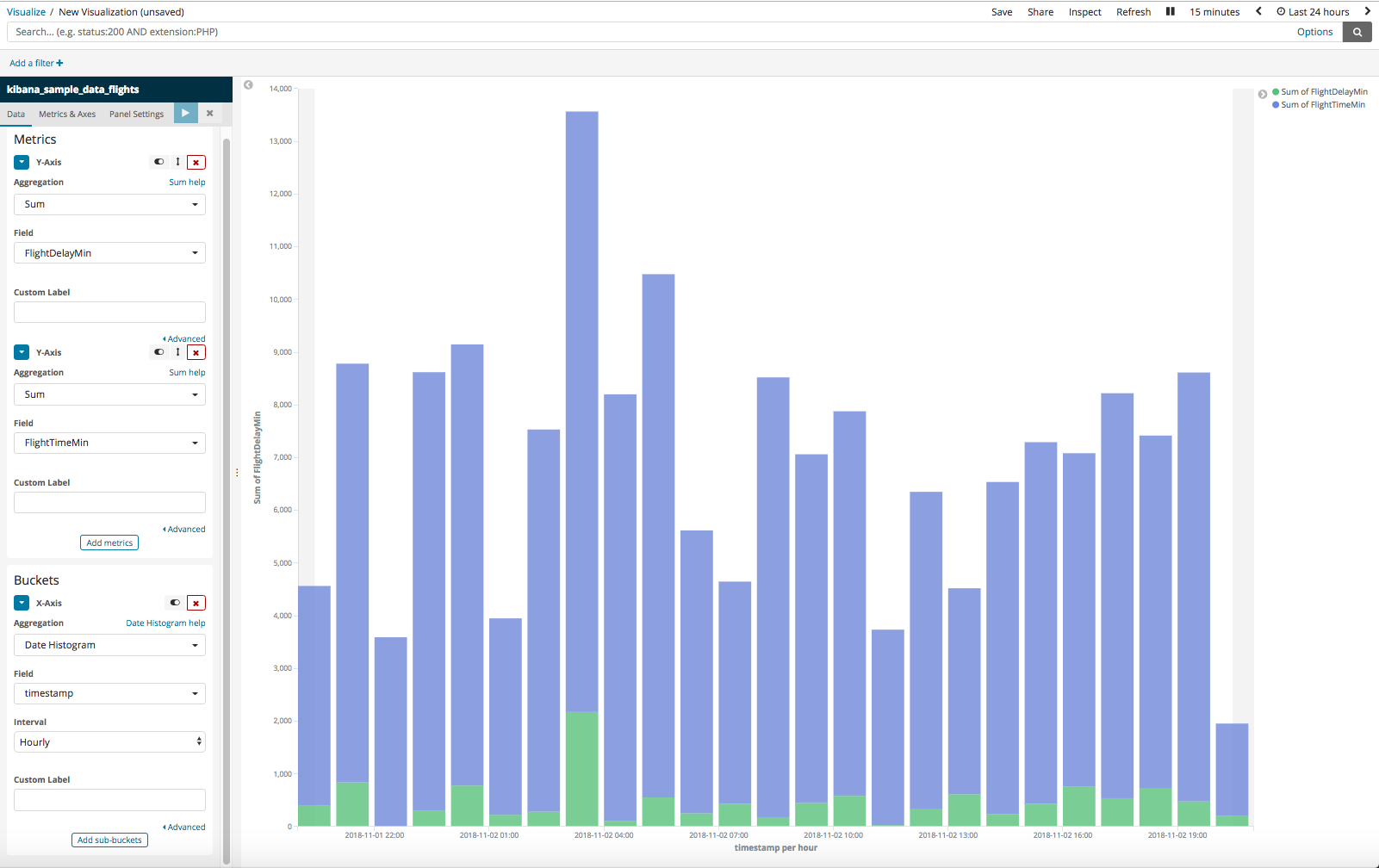
Just for illustration, here's an image of the sort of setup I have now, but using the "Flights" sample database. Here, I've created a stacked bar chart of the number of minutes delayed, with the number of flight minutes. Can we stretch each bar up so that we're effectively looking at the _ratio_ of these summed values, per bucket, instead of the absolute summed values which we see here?
Thanks for any help!
---
### Author:  [@Nathan\_Reese](https://discuss.elastic.co/u/Nathan_Reese)
#### Post date: [November 5, 2018, 4:21am UTC](https://discuss.elastic.co/t/100-stacked-bar-chart-for-date-histogram-data/155240/2 "2018-11-05T04:21:27Z")
You are going to need to use a [Vega visualization](https://www.elastic.co/blog/getting-started-with-vega-visualizations-in-kibana) to build this chart.
Try the following aggregation in `Dev Tools`. This will provide the percentage data needed to build the chart.
```auto
POST /kibana_sample_data_flights/_search
{
"size": 0,
"aggs" : {
"my_bucket_script" : {
"date_histogram" : {
"field" : "timestamp",
"interval" : "hour"
},
"aggs": {
"flight_time": {
"sum": {
"field": "FlightTimeMin"
}
},
"flight_delay": {
"sum": {
"field": "FlightDelayMin"
}
},
"total_time": {
"bucket_script": {
"buckets_path": {
"flightTime": "flight_time",
"flightDelay": "flight_delay"
},
"script": "params.flightTime + params.flightDelay"
}
},
"delay-percentage": {
"bucket_script": {
"buckets_path": {
"totalTime": "total_time",
"flightDelay": "flight_delay"
},
"script": "params.flightDelay / params.totalTime * 100"
}
},
"flight-percentage": {
"bucket_script": {
"buckets_path": {
"totalTime": "total_time",
"flightTime": "flight_time"
},
"script": "params.flightTime / params.totalTime * 100"
}
}
}
}
}
}
```
Then you can use this aggregation request in the vega visualization to build a chart. Below is an example that uses vega-lite to show the flight time perecentage.
```auto
{
$schema: https://vega.github.io/schema/vega-lite/v2.json
title: Chart title
// Define the data source
data: {
url: {
// Apply dashboard context filters when set
%context%: true
// Filter the time picker (upper right corner) with this field
%timefield%: timestamp
// Which index to search
index: kibana_sample_data_flights
// Aggregate data by the time field into time buckets, counting the number of documents in each bucket.
body: {
"size": 0,
"aggs" : {
"my_bucket_script" : {
"date_histogram" : {
"field" : "timestamp",
"interval" : "hour"
},
"aggs": {
"flight_time": {
"sum": {
"field": "FlightTimeMin"
}
},
"flight_delay": {
"sum": {
"field": "FlightDelayMin"
}
},
"total_time": {
"bucket_script": {
"buckets_path": {
"flightTime": "flight_time",
"flightDelay": "flight_delay"
},
"script": "params.flightTime + params.flightDelay"
}
},
"delay-percentage": {
"bucket_script": {
"buckets_path": {
"totalTime": "total_time",
"flightDelay": "flight_delay"
},
"script": "params.flightDelay / params.totalTime * 100"
}
},
"flight-percentage": {
"bucket_script": {
"buckets_path": {
"totalTime": "total_time",
"flightTime": "flight_time"
},
"script": "params.flightTime / params.totalTime * 100"
}
}
}
}
}
}
}
format: {property: "aggregations.my_bucket_script.buckets"}
}
// "mark" is the graphics element used to show our data. Other mark values are: area, bar, circle, line, point, rect, rule, square, text, and tick. See https://vega.github.io/vega-lite/docs/mark.html
mark: bar
// "encoding" tells the "mark" what data to use and in what way. See https://vega.github.io/vega-lite/docs/encoding.html
encoding: {
x: {
// The "key" value is the timestamp in milliseconds. Use it for X axis.
field: key
type: temporal
axis: {title: false} // Customize X axis format
}
y: {
// The "doc_count" is the count per bucket. Use it for Y axis.
field: flight-percentage.value
type: quantitative
axis: {title: "Document count"}
}
}
}
```
This will give you something that looks like

I think you will need to use regular vega (instead of vega-lite) to create the chart that you are really after. Here is a good example of creating a stacked bar chart in vega [https://vega.github.io/vega/examples/stacked-bar-chart/](https://vega.github.io/vega/examples/stacked-bar-chart/). Try putting that example together with the data from the bucket script aggregation.
---
### Author:  [@Nathan\_Reese](https://discuss.elastic.co/u/Nathan_Reese)
#### Post date: [November 5, 2018, 4:35am UTC](https://discuss.elastic.co/t/100-stacked-bar-chart-for-date-histogram-data/155240/3 "2018-11-05T04:35:21Z")
Actually you can do this without vega. Just set the `Y-axes` `mode` field to `percentage` (under the "Metrics & Axes" tab).

---
### Author:  [@Jonathan\_Rice](https://discuss.elastic.co/u/Jonathan_Rice)
#### Post date: [November 6, 2018, 12:54am UTC](https://discuss.elastic.co/t/100-stacked-bar-chart-for-date-histogram-data/155240/4 "2018-11-06T00:54:39Z")
Ah, _there_ it is! I had been trying to find that "percentage" mode, but I had missed it. Thanks a lot!
---
### Author:  [@system](https://discuss.elastic.co/u/system)
#### Post date: [December 4, 2018, 12:54am UTC](https://discuss.elastic.co/t/100-stacked-bar-chart-for-date-histogram-data/155240/5 "2018-12-04T00:54:43Z")
This topic was automatically closed 28 days after the last reply. New replies are no longer allowed.