Based on the standard visualization for Metricbeat data: [Metricbeat System] Host overview ECS
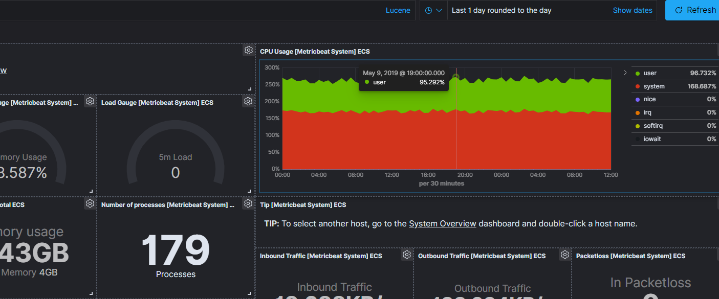
Is it possible to filter the entire dashboard based on what we select on one of the visualizations's time series? For example, I would like to click on a point of CPU Usage Visualization so that the entire dashboard will be filtered to the given point in time: May 9, 2019 @ 19:00:00.000 - May 9, 2019 @ 19:30:00.000.
Is that possible or do I have to rely entirely on time window quick select in the top right corner?
yes, you can do this, but you need a bar-chart. When you add a bar-chart to the dashboard, you can click a bar, and it will use the time-interval of that bar to change the time-range fort the bar chart.
You can try one of the sample dashboards and see it in action
e.g. hover over the bar and then click it to filter on time
Yep, I already tried that using different type of visualizations, but I was wondering whether the same can be achieved in Visual Builder. Seems like it's not, as least for now.
Apache, Apache Lucene, Apache Hadoop, Hadoop, HDFS and the yellow elephant
logo are trademarks of the
Apache Software Foundation
in the United States and/or other countries.