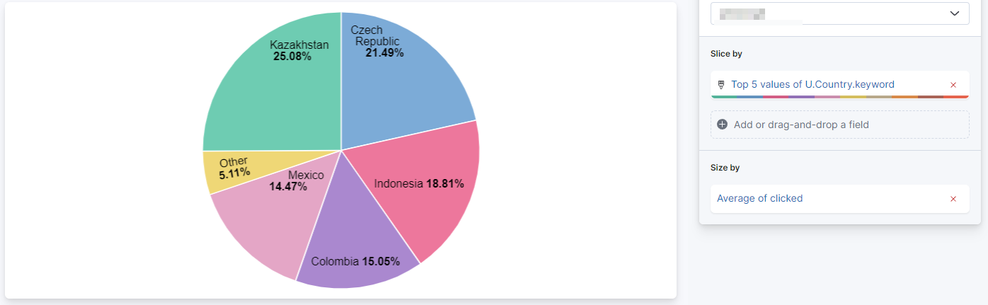
I would like to show a graph of countries with the percentage of applications.
To do so, I created a Lens of type Pie that I Sliced by the Top 50 values of country, and Sized by the average of applied.
I used the top 50 despite having only about 10 countries in case there are new countries. When the number is above 10, adding more to the top does not change the result (which is logical).
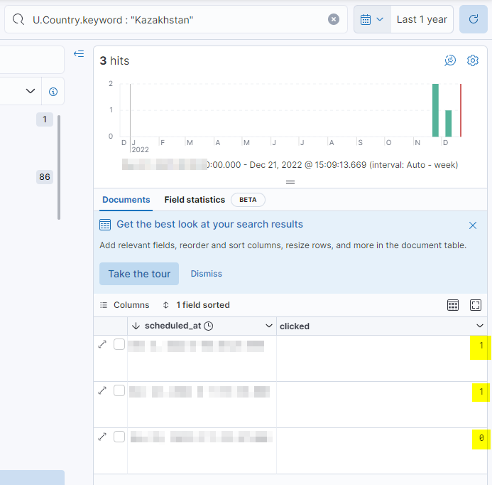
So I have a pie that I thought was fine, except when I started to have a closer look at the numbers. Specifically, when clicking on the pie section for japan, I saw that it had a 67% of applications. This is the correct result ((1 + 1 + 0)/3).
The full pie, however, does not show 67% for japan, but a smaller value. With the data I have this is 25.08% (there are indeed 3 entries for japan in my data, but about 20k for other countries).
What is the exact calculation used in Lens of type Pie, Sliced by the Top N values of X, and Sized by the average of Y?
I did have "Group ... as Other" set up but it was redundant (I do no have "Other" as my Top 50 values cover all possible (10) values I have now). I tried to switch it on and off, as well as the "Accuracy" one but it did not change the problem.
Hmmm, going forward with your comment about Other, I picked a field where I have a large diversity (say, age which is not present in the example data above, but where I would have various values).
I chose Top 5 age and again sized by applied (which means "what is the % of people of age X that applied"). It gave a number.
I then tried to take more Top values, and the relative % for the existing ones changed. I do not understand this at all - how can changing the number of visible values change the ratio of applied (= the percentage, effectively) for a given value? It should always be the average of applied for that value, this is independent of anything else.
If I do not have Other and start at, say, Top 5 I have 5 slices in the pie. As I increase the number of slices, the percentage decreases (again just for clarity: this is the average of a 0 or 1 value, so it should be independent of anything else, including the number of displayed elements).
Same when I have Other, I just start with 5+1 slices (5 for the top ones, and Other) and changing the number of Top values changes the percentage.
Note: when you say
reduce its size
I assume you mean what I mean above - that is that the displayed relative percentage is changed. I am not talking about the "visual size" of a slice (its angle if you wish). Sorry if this is obvious, I just wanted to make sure we are talking about the same thing.
I think there's a misunderstanding of the pie visualization here: a pie visualization is used to represent portions (slices) to a whole. The total of a pie chart will be always 100%.
Even if 67% of the time documents with Kazakhstan value have an applied: 1 value, in the pie chart that will be normalized to the whole sum of all the slices represented.
It sounds like you are looking for something like a bar chart here to see how often applied: 1 is set per country.
I've reproduced something similar here with the Flight sample dataset where for each carrier I show the % of cancelled flights:
As metric in this case I've used a formula to compute the %: count(kql="applied: 1") / count() would be in your case. As formatter I've set the percentage one.
Would this work in your case?
I actually did not want to use the pie visualization which is usually the worst one to use. I tried with "Bar vertical percentages" and I was always getting 100% and gave up.
Looking at your example, I used the plain "Vertical bar" and changed the vertical display to % and it worked. Thanks again.
In retrospect, using the pie visualization made zero sense in my case as the percentages do not add up to 100% - I was kinda hoping that the angle would be a function of the value of the average.
Apache, Apache Lucene, Apache Hadoop, Hadoop, HDFS and the yellow elephant
logo are trademarks of the
Apache Software Foundation
in the United States and/or other countries.