That is possible but you would need to change the shape of your data. Here's an example of one (slightly hacky) way to achieve this in Canvas without changing your Elasticsearch index.
The color arg in pointseries splits a column into multiple series per unique value in a single column. There currently isn't a way to assign a series to a specific column in Canvas. So ideally, your data would be in a shape like this:
{ "timestamp": "2019-05-01 00:00:00", "count_type": "active", "count": 176 }
{ "timestamp": "2019-05-01 00:00:00", "count_type": "inactive", "count": 100 }
and you could set pointseries color="count_type".
I used csv to mock your data, and here is what I ended up with:
csv
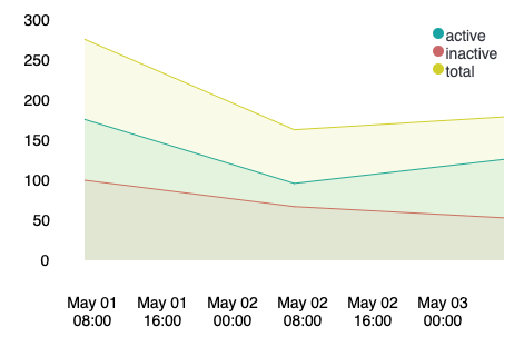
"timestamp,count_active,count_inactive
2019-05-01 00:00:00, 176, 100
2019-05-02 00:00:00, 96, 67
2019-05-03 00:00:00, 126, 53"
| alterColumn count_active type="number"
| alterColumn count_inactive type="number"
| ply
by="timestamp"
expression={csv
data={string
"count_type,count
" "active," {getCell "count_active"} "
" "inactive," {getCell "count_inactive"} "
" "total," {math "count_inactive + count_active"}
}
}
| alterColumn "count" type="number"
| alterColumn "timestamp" type="date"
| pointseries x="timestamp" y="count" color="count_type"
| plot
defaultStyle={seriesStyle lines=1 fill=1}
palette={palette "#01A4A4" "#CC6666" "#D0D102" "#616161" "#00A1CB" "#32742C" "#F18D05" "#113F8C" "#61AE24" "#D70060" gradient=false}
| render
And a stacked version:

csv
  "timestamp,count_active,count_inactive
  2019-05-01 00:00:00, 176, 100
  2019-05-02 00:00:00, 96, 67
  2019-05-03 00:00:00, 126, 53"
| alterColumn count_active type="number"
| alterColumn count_inactive type="number"
| ply
    by="timestamp"
    expression={csv
     data={string
       "count_type,count
       " "active," {getCell "count_active"} "
       " "inactive," {getCell "count_inactive"} "
       " "total," {math "count_inactive + count_active"}
      }
    }
| alterColumn "count" type="number"
| alterColumn "timestamp" type="date"
| pointseries x="timestamp" y="count" color="count_type"
| plot
    defaultStyle={seriesStyle lines=1 stack=1 fill=1}
    palette={palette "#01A4A4" "#CC6666" "#D0D102" "#616161" "#00A1CB" "#32742C" "#F18D05" "#113F8C" "#61AE24" "#D70060" gradient=false}
| render
You should be able to replace the first 3 functions: csv and the two alterColumns with your datasource to achieve a similar chart.
The important (and hacky) piece is this:
ply
    by="timestamp"
    expression={csv
     data={string
       "count_type,count
       " "active," {getCell "count_active"} "
       " "inactive," {getCell "count_inactive"} "
       " "total," {math "count_inactive + count_active"}
      }
    }
which uses ply to group your datatable by the timestamp and maps your count_active value to a row with count_type:"active" and count: 176, your count_inactive value to a 2nd row with count_type:"inactive" and count: 100 for each unique timestamp, and the sum of count_active and count_inactive to a 3rd row with count_type: total and count:276.