Referring below/attached table screenshot:
We want to show different color coding of a bar graph (or) a row item in a table depending on a threshold value.
Threshold is not same for processes mentioned under 'processes name' column.
From screenshot, we want to achieve:
For BOT 1, when Execution% > 75% then we want to show that row in Green.
But for BOT 2, when execution% < 50 %, then we want to show that row in Red.
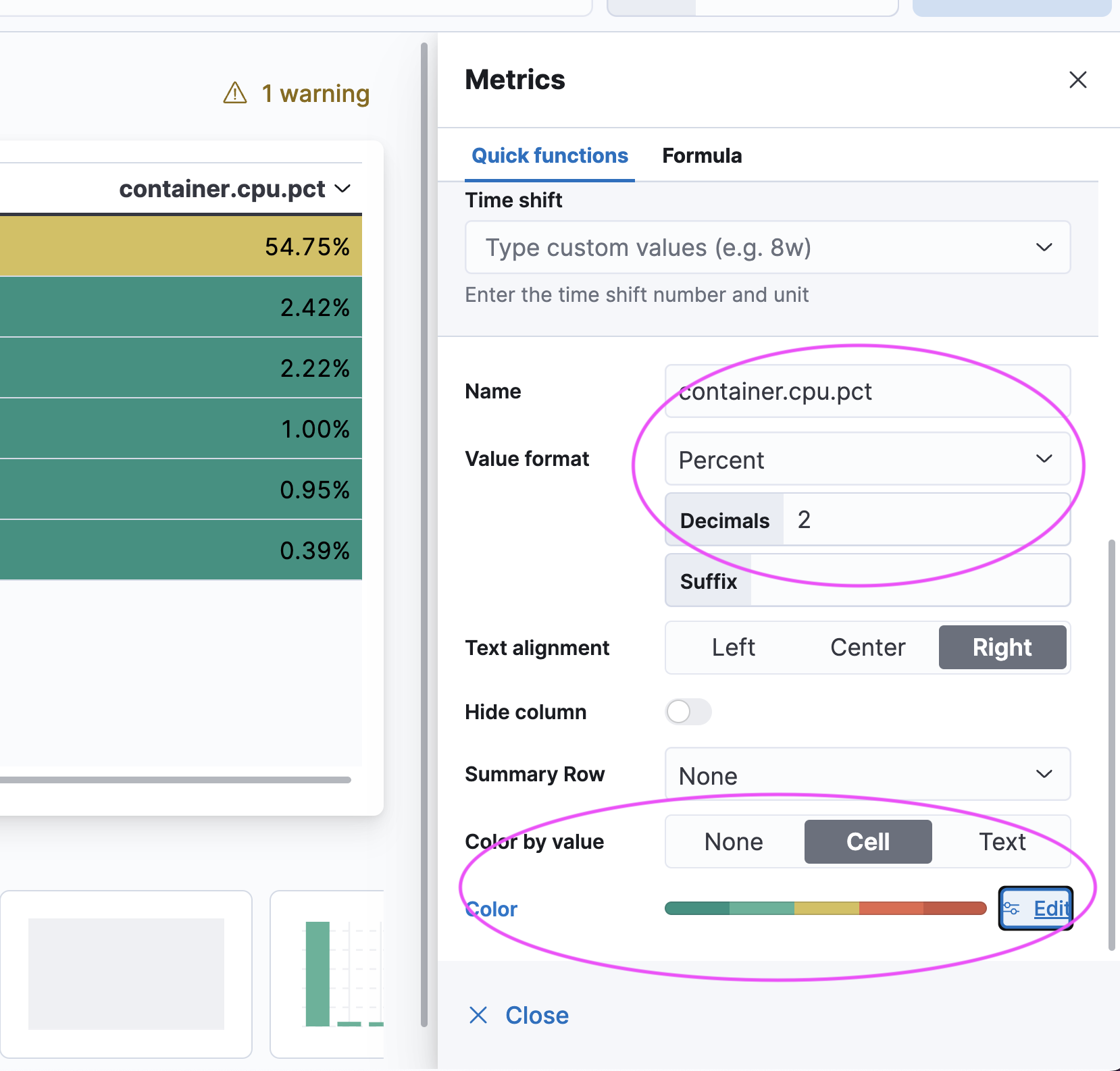
Now here is the tricky part DO NOT pick pick percent type IF your number is already a Percent
Percent means pick a Percent of the Total Range which is a Percent of a Percent it will be confusing
Pick Number
The UI is a little Weird / Strange / Buggy Pick your Colors and Start from your Max Color Down... it will sometime reset on you. But it Works
@stephenb Thanks a lot . With suggested approach I could color the table. But the issue in my case is that threshold is NOT same for all processes ('process name' column in screenshot).
For process 1 threshold will be 50%, for process 2 it will be 75% etc. With current approach we can highlight rows with same threshold across all process names.
How can we put this additional condition- proces name and threshold combo? Please suggest.
Thanks.
Apache, Apache Lucene, Apache Hadoop, Hadoop, HDFS and the yellow elephant
logo are trademarks of the
Apache Software Foundation
in the United States and/or other countries.