Displaying sparse data in Timelion using fit()

Hi,

I am trying to plot two charts to show correlation between them.
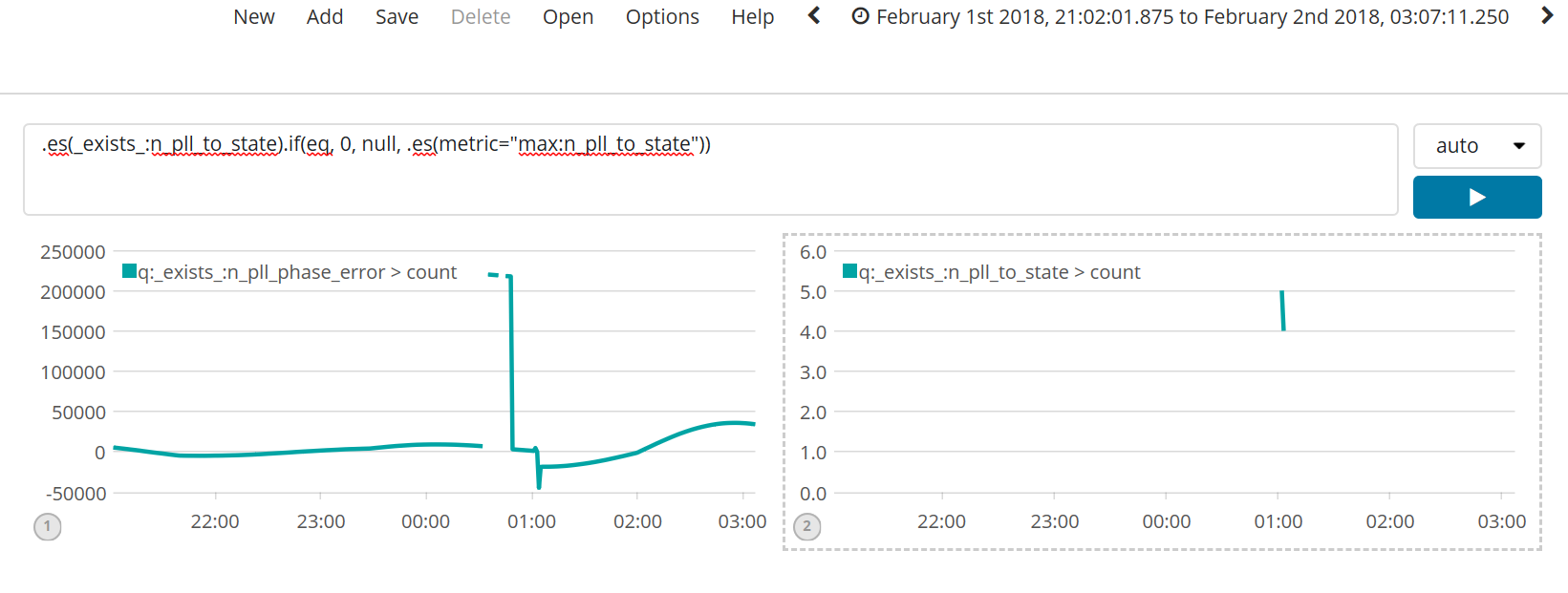
My first plot shows the phase error, the events for which are coming at regular interval (every second, except when there is some problem at which time there will be some gap).
My second plot is to show state transition. This state transition events are sparse and we get only a few data points (depending on the value of phase error).
So I read up this: https://www.elastic.co/blog/sparse-timeseries-and-timelion
and prepared following Timelion queries:
Phase Error: .es(exists:n_pll_phase_error).if(eq, 0, null, .es(metric="max:n_pll_phase_error"))
State Transition: .es(exists:n_pll_to_state).if(eq, 0, null, .es(metric="max:n_pll_to_state"))
And here is the incoming data for state transitions:


Within the same interval, phase error have 147,593 incoming events.

With the above queries, I see following two charts. Phase error is good but State transition is just a line.

I zoom in and don't see any data for second chart.

I use points() function and see all the 7 events.
.es(exists:n_pll_to_state).if(eq, 0, null, .es(metric="max:n_pll_to_state")).points()

Instead of points(), I use fit(none) then the chart almost looks correct.
.es(exists:n_pll_to_state).if(eq, 0, null, .es(metric="max:n_pll_to_state")).fit(none)

The reason I say almost is cause the first event came in transitioning from state 1 to state 3 but in the fit it shows state as 3 from the beginning of time which is misleading.
What I would to see instead is below chart:


Where the read line indicates the state change happened from 1 to 3 and happened at 00:32 (no assumption about prior state since it doesn't know what it was). Similarly, towards the end the line ends at 01:06 indicating that's all it knows.

If this is not doable, then I'd at least like to be able to show the initial state transition from 1 to 3 (its fine if fit() extrapolates the same data to past and future.)

Any other tips as to what's the best way to show state transitions?

Thanks
Nikhil

Hi Nikhil,
I have asked @timroes for some help here. It will be handled soon.

Thanks
Rashmi

Hi,

thanks a lot for that very details explanation and providing so many screenshots.

As you figured out correctly, lines between point will only be drawn if there is no sparse data between it, and you will need the fit method to otherwise tell Timelion how to draw the line.

I am unfortunately still a bit confused about the red line you are drawing. If I look at your points chart above, it seems like there is no point 1 at ~00:30:00 and the first point is 3. So I am not seeing where the 1 should come from? Is this because of the semantic of your data, that you ALWAYS want to assume, no matter what your first point in your timelion chart is, that there is a point with value 1 to the complete left of the chart, and the first point will always have a line from position 1 to it?

Cutting of the chart while using the fit function on the right hand side won't be possible unfortunately.

Cheers,
Tim

Also if I get your semantics right, and you want to visualize when a state change occurred, I think you want to use fit(carry) and not fit(none). I show the difference in the two screenshots here:

fit(none)

fit(carry)

As you can see, with fit(carry) the lines are dropping/raising at exactly the point a new event/document/data-point happened. With fit(none) they will drop/raise in the between two data points.

I also think .lines(steps=true) (used in the charts above) might be a good addition for you, since it won't interpolate the line between two points and thus resulting in that kind of stepped graph, which represents your state changes better?

Thank You Tim for your clear explanation and suggestions. Yes fit(carry) and lines(steps) are indeedio the right options for me.

About the red line, Yes, the chart is showing exactly what the data should. My problem is I am looking at intermittent set of data.
The state change to 1 was somewhere in the past and outside the window I am looking at. What the fit() function does (and expectedly) is that it extrapolates the first 'to' state in the past which is incorrect with what data I have (which I know from 'from state'). So I want to know if there is any 'technique' that I can use to fix this discrepancy.

What I thought I could do was add a dummy event during my log ingestion where I copy the first 'from' state as a 'to state'. Are there any better ways that I am unaware? Other option I was considering was to show the line only for the interval I have the logs. That way I at least don't show misleading information. But you saying that is not possible.

-Thanks
Nikhil

So the value 1 is not a static value (like a baseline), but just the previous value outside of the drawn graph? That will make it really hard. I think this can only work, if you know exactly how far that point (with value 1) is away from the first one in the graph, by tricking around using offset. Is this distance always the same? Then I could try to craft you an expression that might work.

Regarding removal of the line. That should be possible for the beginning of the graph, so that you would end up with the point starting at 3 (but not a line from the previous outside-of-graph value up to that point), but not for the end of the graph (as mentioned in my previous answer).

But beforehand, I think you can reduce the function you posted above:

.es(_exists_:n_pll_to_state).if(eq, 0, null, .es(metric="max:n_pll_to_state"))

a bit shorter to:

.es(q="_exists_:n_pll_to_state", metric="max:n_pll_to_state")

The max aggregation will automatically return null if there are no documents within this bucket (and not 0), so the if should be redundant and you can just use one es function.

Assuming that this shorthand works, the way to cutoff the beginning of your graph, would be the following:

.es(q="_exists_:n_pll_to_state", metric="max:n_pll_to_state").cusum().if(eq, 0, null, .es(q="_exists_:n_pll_to_state", metric="max:n_pll_to_state").fit(carry)).lines(steps=true)

How does this actually work? We are drawing the (unfitted) graph first and build the cumulative sum of it. This will be 0 before the first point has been found, and after the first point never 0 (since it just sums up the values of all points from then on).

Using the .if function on this .cusum output, we can set the value to null when the cusum == 0. That way we will cut off the line before the first point. If the cusum not equals 0, we will use the proper (fitted) value, that we want to show.

The output could look like that:

1 Like

Wow Tim. My mind is blown. (OTOH there is some much more to learn.)
BIG thanks. This does solve my problem.
If anybody copies the above command just change exists to _exists_ .

Cheers
Nikhil

Hey Nikhil,

I copied your code form earlier where this got rendered as markdown, sorry :smiley: I corrected my post now to use _exists_.

Glad I could help you. Feel always free to come back with more questions :slight_smile:

Cheers,
Tim

I figured. When I first typed, it changes to italic. Had to make it preformatted text. Thanks.

This topic was automatically closed 28 days after the last reply. New replies are no longer allowed.