Hello Elastic community,
I've been struggling to find a way to identify what I like to call "escalations" in my dataset using the Kibana visualizations.
Basically I have event logs from several machines in our infrastructure that contain a field called "severity" with 5 different values/categories ["Normal", "Minor", "Warning", "Major", "Critical"].
What I want to do is create a visualization that easily identifies machines that have "escalating" severities over time.
I have attached a rudimentary picture as to what I imagine it could look like but I am open to other approaches as well.
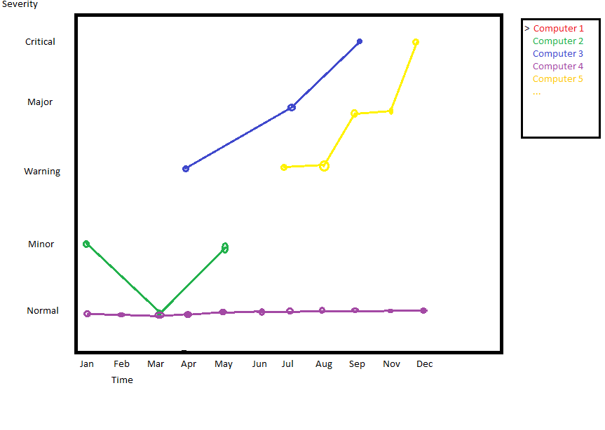
In the picture you can see that Computer 3 and Computer 5 have this "escalation" I'm talking about where over time their log entries starting to increase in severity.