I'm quite new to kibana, and there's something really simple I'd like to do, and can't find the way.
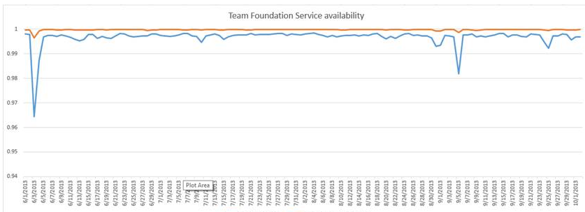
I want to measure the availability of an API over time, so it's simply the percent of successful queries (http 2xx) over the total, along time. Basically something like this
If you don't already have the api access log data, I'd highly recommend using Heartbeat which basically pings a hostname/api and then displays the data in the Uptime app in Kibana.
If you already have the data, you can try this:
Create an Area chart visualization on the index that you have.
Set Count as a metric on the Y axis
Set a Date histogram on your time field in the X Axis.
Select Split series on the X Axis, with a Filters aggregation.
In the field, select the field that has the response (in the sample data it's a string field, so i'm going to treat it like that here too).
First filter should be response.keyword: 2* (here response.keyword is the field with the reponse)
Second filter should be NOT response.keyword: 2*
In the metrics & axes tab of the visualization options. set the Y-axis to Mode: Percentage.
You can change it from chart type: area to line if you want it look exactly like your example.
Thanks for your answer.
I find this convoluted... but ok, I managed to do that. Problem now is with the scale of y axis.
First, it's not dynamically adjusted to what happens, and with an availability in the 99.5% the labels are just useless
Apache, Apache Lucene, Apache Hadoop, Hadoop, HDFS and the yellow elephant
logo are trademarks of the
Apache Software Foundation
in the United States and/or other countries.


