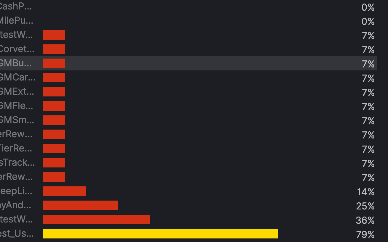
I am using TSVB on Kibana 7.4.2 to show a list of tests and their pass rate using Filter Ratio. Using Top N this list displays the test name, color bar, and pass rate, sorted by pass rate. The names of the tests are truncated and the full test name is not visible, even when stretching the screen very wide. That is due to the color bar in the middle of the chart which is extremely wide. The color bar is built-in to this visualization and cannot be removed. How can I remove that color bar or reduce its width in Top N?
Also, switching from Top N to Table removes the color bar and the test names are fully visible, but the pass rate is no longer sorted. Is there a way to sort the pass rate using Table?
This use case makes sense, but I think the only option is to pre-aggregate your test data so that you can do a simpler visualization that supports sorting. You can calculate a ratio using the ES transforms feature and then build a visualization using the new index.
Thanks for the information. I am a little confused on the lack of configuration in the visualization panels. When trying to use a filter ratio, there seems to be very limited options for its use. I won't bring up other issues or concerns here, but just wanted be up front about the fact that displaying a list of sorted ratios, a simple metric, is very difficult.
I agree that it's difficult to do this in the product today, but hopefully the workarounds I gave help. If you really need full customization, use Vega.
Apache, Apache Lucene, Apache Hadoop, Hadoop, HDFS and the yellow elephant
logo are trademarks of the
Apache Software Foundation
in the United States and/or other countries.