Hi, i'm gonna analyze user retain using an accumulate graph like this:
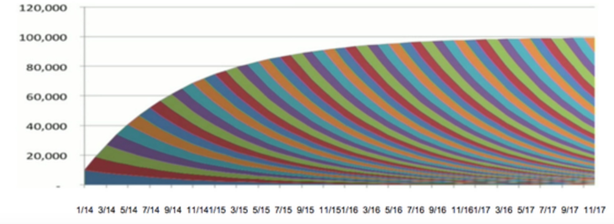
The x-axis represents week. The y-axis represents unique ip count. The users with same color means they register at the same week. So i can see how my project goes.
I can store any information into ES if needed.
Is there a way to draw graph like this?