sahotay
May 31, 2018, 3:00pm
1
Hello There!
I'm using es query in Timelion to showcase vulnerability report. In my case, we have vulnerabilities in the following manner
But I want to enlarge Critical so that everyone will focus on that
Here is the details view of my query:
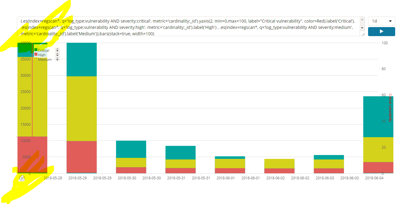
(.es(index=regscan*, q='log_type:vulnerability AND severity:medium', metric='cardinality:_id').label('Medium'), .es(index=regscan*, q='log_type:vulnerability AND severity:high', metric='cardinality:_id').label('High'), .es(index=regscan*, q='log_type:vulnerability AND severity:critical', metric='cardinality:_id').label('Critical')).bars(stack=true, width=100).color('GoldenRod:Red:DarkRed')
which shows graph
As you can see the number for Critical is very low compared to others and very hard to see in this graph.
Is there a way, if I hover to this, this will get maximize ?
tsullivan
May 31, 2018, 7:38pm
2
Hi, maybe just try putting the High severity counts on a secondary Y-Axis. Check out the .yaxis() function.
sahotay
June 4, 2018, 1:57pm
3
Hello @tsullivan
I have tried using .yaxis() but didn't get proper results , can you help me on this please.
tsullivan
June 4, 2018, 4:27pm
4
Hi, What do you mean by didn't get proper results? Can you share your expression?
sahotay
June 4, 2018, 6:21pm
5
It looks like this (that means i'm somewhere seeing stack at the bottom and also on the top)
tsullivan
June 4, 2018, 7:07pm
6
Interesting, thanks for the graphic.
Can you share your entire query as text though?
sahotay
June 4, 2018, 7:10pm
7
tsullivan:
uery as text tho
(.es(index=regscan*, q='log_type:vulnerability AND severity:critical', metric='cardinality:_id').yaxis(2, min=0,max=100, label="Critical vulnerability", color=Red).label('Critical'), .es(index=regscan*, q='log_type:vulnerability AND severity:high', metric='cardinality:_id').label('High') , .es(index=regscan*, q='log_type:vulnerability AND severity:medium', metric='cardinality:_id').label('Medium')).bars(stack=true, width=100)
sahotay
June 6, 2018, 8:55pm
8
Hello:
Did you get a chance to check on this please.
Thank you very much in advance!
sahotay
June 8, 2018, 4:02pm
9
Hello:
Anyone there to help me out please
tsullivan
June 11, 2018, 8:01pm
11
Hi, sorry for the delayed response - I haven't had a chance to look into this until now.
I think it looks strange because stacked bars make no sense when you have multiple y-axes. I would probably do this expression to turn off stacking
(
.es(q='severity:critical')
  .yaxis(2, label="Critical")
  .label('Critical')
  .color(Red),
.es(q='severity:high')
  .yaxis(1, label="Med / High")
  .label('High')
  .color(Orange),
.es(q='severity:medium')
  .yaxis(1)
  .label('Medium')
  .color(Yellow)
)
.bars(stack=false)