How to set Split Lines when use nested json?

hello all:

kibana version 5.3.0

I want to show chart like this:

data format like this is ok.

{
"_index": "log20170524",
"_type": "sysinfo",
"_id": "AVw5TnPNslqZOjiWet_p",
"_score": null,
"_source": {
"info": [
{
"PercentSize": "22",
"type": 1,
"name": "cpu"
}
],
"datetime": "1495610061000"
},
"sort": [
1495610061000
]
}

{
"_index": "log20170524",
"_type": "sysinfo",
"_id": "AVw5TnPNslqZOjabet_p",
"_score": null,
"_source": {
"info": [
{
"PercentSize": "87",
"type": 1,
"name": "mem"
}
],
"datetime": "1495610061000"
},
"sort": [
1495610061000
]
}

but I change data to this:

{
"_index": "log20170524",
"_type": "sysinfo",
"_id": "AVw5TnPNslqUJjiWet_p",
"_score": null,
"_source": {
"info": [
{
"PercentSize": "87",
"type": 1,
"name": "mem"
},
{
"PercentSize": "38",
"type": 2,
"name": "cpu"
},
{
"PercentInode": "49",
"PercentSize": "73",
"type": 9,
"name": "DiskTotal"
},
],
"datetime": "1495610061000"
},
"sort": [
1495610061000
]
}

the result chart:

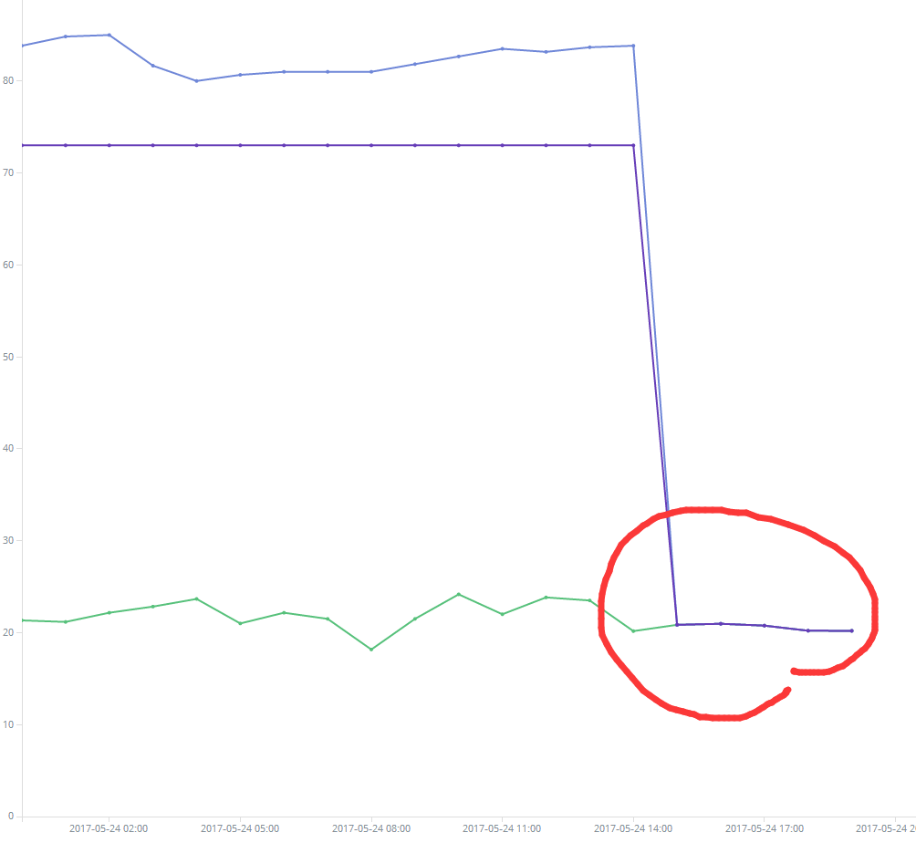
the right chart is all data average,not one.
how to set ?

my setting:


Thank you!

I'm not sure I understand your question, but here's a couple of points.

  1. Kibana Visualizations always show aggregated data, not individual docs. If you zoom in to a small time range you might very well see individual doc values as the same as the aggregation. So if at one timestamp you only have one "cpu" value it doesn't matter if you choose "min", "max", "avg" etc because for a single value they're all the same.

  2. It's much easier to read the docs you post if you format them are mark them as code like this;

data format like this is ok.

{
	"_index": "log20170524",
	"_type": "sysinfo",
	"id": "AVw5TnPNslqZOjiWetp",
	"_score": null,
	"_source": {
		"info": [{
			"PercentSize": "22",
			"type": 1,
			"name": "cpu"
		}],
		"datetime": "1495610061000"
	},
	"sort": [1495610061000]
}
{
	"_index": "log20170524",
	"_type": "sysinfo",
	"id": "AVw5TnPNslqZOjabetp",
	"_score": null,
	"_source": {
		"info": [{
			"PercentSize": "87",
			"type": 1,
			"name": "mem"
		}],
		"datetime": "1495610061000"
	},
	"sort": [1495610061000]
}

but I change data to this:

{
	"_index": "log20170524",
	"_type": "sysinfo",
	"id": "AVw5TnPNslqUJjiWetp",
	"_score": null,
	"_source": {
		"info": [{
			"PercentSize": "87",
			"type": 1,
			"name": "mem"
		},
		{
			"PercentSize": "38",
			"type": 2,
			"name": "cpu"
		},
		{
			"PercentInode": "49",
			"PercentSize": "73",
			"type": 9,
			"name": "DiskTotal"
		},
		],
		"datetime": "1495610061000"
	},
	"sort": [1495610061000]
}
  1. It sounds like your first chart was created from the data where each metric was it's own doc in Elasticsearch and looks like you want. Why did you change to have multiple metrics in each doc?

Regards,
Lee

Thank for your reply.

  1. the data is inserted at the same time. used to show the status of server machine. so the datetime or other information(like ip, mac) is same. use nested struction can save storage space, only need insert one record once. otherwise i need insert three records once.

  2. my problem is "i want to show cpu, memory, disk separately, the value of them are diffrent, but strange thing is the aggregation value of them are the same, it's wrong"

forgive me for my poor English

Regards,
Tonghualin

Did you mix the data from your first format and your second format in the same index? Or did you wipe the index out and load the data the second way?

Here's a suggestion for a different format that works for charting. In this test data I created I just concatenated the 3 name fields with the PercentSize values;

post /discuss3/test
{
  "memPercentSize": 87,
  "cpuPercentSize": 38,
  "diskPercentSize": 73,
  "datetime": "2017-05-30T00:00:00"
}
post /discuss3/test
{
  "memPercentSize": 97,
  "cpuPercentSize": 48,
  "diskPercentSize": 83,
  "datetime": "2017-05-30T00:01:00"
}
post /discuss3/test
{
  "memPercentSize": 47,
  "cpuPercentSize": 18,
  "diskPercentSize": 23,
  "datetime": "2017-05-30T00:02:00"
}
post /discuss3/test
{
  "memPercentSize": 57,
  "cpuPercentSize": 58,
  "diskPercentSize": 53,
  "datetime": "2017-05-30T00:03:00"
}

Now I can add each of those to a line chart like this;

This topic was automatically closed 28 days after the last reply. New replies are no longer allowed.