hi all ,
I have a column in data which two values are Human and Bot, how i can calculate percentage and show in one gauge. for example 7 documents are Human and total documents are 1000 from 1/1 to 2/15 ,then Human percentage is 7% and Bot is 93%, like as below image,

is it possible to use gauge to display?
A gauge is usually used to display a single metric.
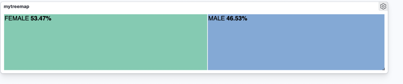
Partition charts like pie chart, donut chart, treemap, etc... are usually used to display how the whole is split by different categories - like in your case.