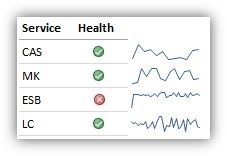
We have line charts, but it's currently not possible to embed a very small line chart inside a table like that. The best I can think of is to add a data table separately to a dashboard, along with a line chart for each service (each visualization has a different query to filter on the service name)
Apache, Apache Lucene, Apache Hadoop, Hadoop, HDFS and the yellow elephant
logo are trademarks of the
Apache Software Foundation
in the United States and/or other countries.