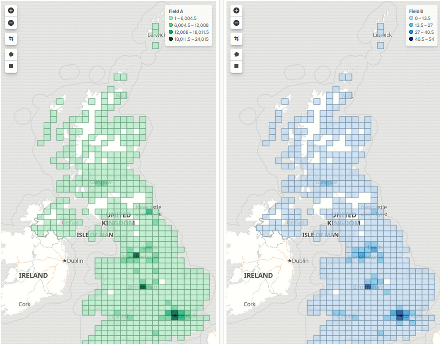
I have several Coordinate Maps to try to identify certain things in my data, and I have these together in a dashboard. However, all the maps show the same areas, with all their ranges starting at 0, and this is making it harder to locate useful data, especially if the information is in the lower quarter. The metric aggergator I am on the map is SUM. For each document I am interested in has a field either set to 1, or doesn't exist.
Is there a way to get the coordinate map to not show the 0 values, or to at least start the ranges from 1?
Previously, I had success by using a separate index pattern for each map, but this is now resulting in close to 30 separate index patterns, and several cloned index entries (with differently named indexes), but this is quickly becoming untannable. As I go along, I can see this easily approaching 100 separate maps.
Possibly, but I am not sure how to do this on a Visualization when its in a Dashboard. If it was just using that standard filter at the top, then it would undermine the nature of the Dashboard
Just for future reference, filters you add when creating a visualization are not applied to all visualizations on a dashboard; they are only applied to the visualization itself.
Apache, Apache Lucene, Apache Hadoop, Hadoop, HDFS and the yellow elephant
logo are trademarks of the
Apache Software Foundation
in the United States and/or other countries.