Greetings!
Is there any possibility to create pareto chart in Kibana (v.6.5.1)?
Thank you.
Greetings!
Is there any possibility to create pareto chart in Kibana (v.6.5.1)?
Thank you.
What's a pareto chart?
I think that should be easily doable with Timelion, as you can combine a source using .bars() with a source using .line(), and you can use .cusum() to get a cumulative sum over time.
As a very simple sample (without any filtering, just using the count of all data):
.es(*).bars().color(green).add(200)
,.es(*).lines(steps=true,width=1).color(red).cusum().yaxis(yaxis=2,position=right)
Hi @BennyInc @warkolm, Thanks for your replying.
@BennyInc ,I really appreciate the suggestion and guidance given.
I would like to create a pareto chart with showing:
x-axis is the contents of a field & right y-axis is the cumulative percentage.
For example, 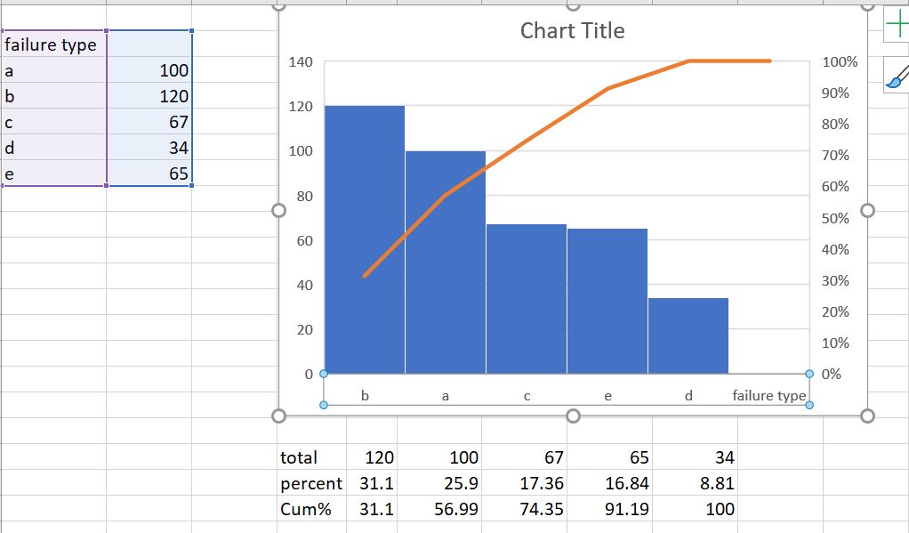
Kindly advise on the method to achieve this . Thank you.
Ah, that won't work with Timelion - time-based data only.
You can try using Vega or Canvas to achieve this, but I haven't used them extensively yet.
@BennyInc Thank you.
© 2020. All Rights Reserved - Elasticsearch
Apache, Apache Lucene, Apache Hadoop, Hadoop, HDFS and the yellow elephant logo are trademarks of the Apache Software Foundation in the United States and/or other countries.