On an article about syslog dashboards I found an image with a visualization I'd like to recreate for my dashboard, but they don't specify what kind of visualisation it is and how they made it.
It's the "Log View" visualization I would like to recreate, does anyone know how?
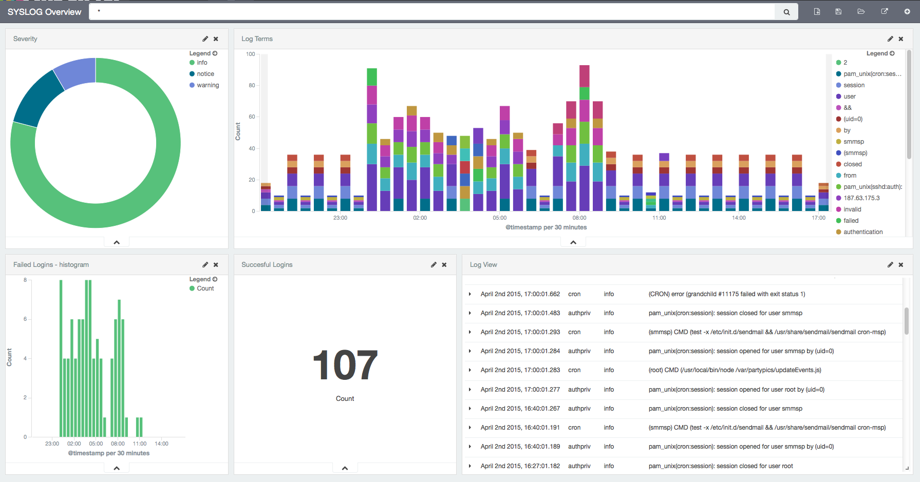
I tried recreating it with a data table, but seem to be stuck with the count metric.
