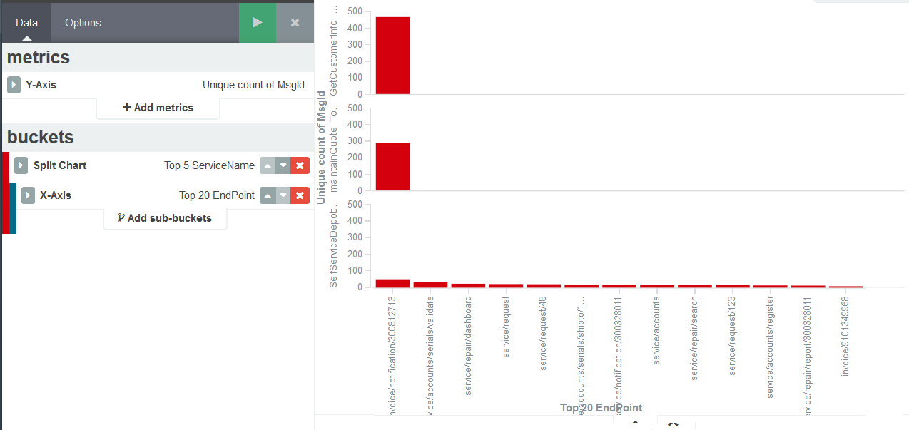
I have few APIs and each of them have multiple endpoints (like function/method name). I created a vertical bar chart, split chart (row) using API name, and X-Axis associated with the endpoints.The Y-Axis is simple hit count.
How can I have each split chart showing only their respective endpoints in the X-Axis? Currently it is one X-Axis with all the endpoints, and as a result the X-Axis is very long and each chart has a lot of empty fields.
One workaround I have is to create a bar chart visualization for each API respectively, but this will eventually requires lots of effort to maintain them when more APIs are developed. Please advise if there's better way to achieve this.
Refer to above, the top 2 services by the name of GetCustomerInfo and maintainQuote has only one endpoint, whereas the service at the last row SelfServiceDepot has got multiple endpoints.
To better explain - the first X-Axis field appears as blank is because GetCustomerInfo and maintainQuote has only one endpoint and it is default to some kind of root path which appears as blank. This does not apply to SelfServiceDepot because it has multiple endpoints and there's no default endpoint.
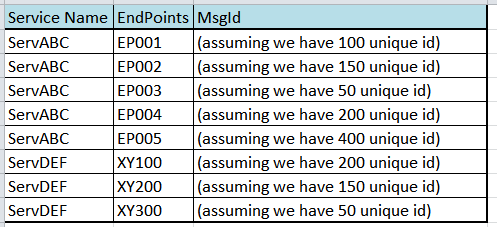
I would like to know if there is a way for us to achieve something like below:
Gotcha. I think the only way to achieve that would be to override the "blank" value for the first two services with the value you'd like to plot on the x-axis. The Logstash mutate filter should let you do that.
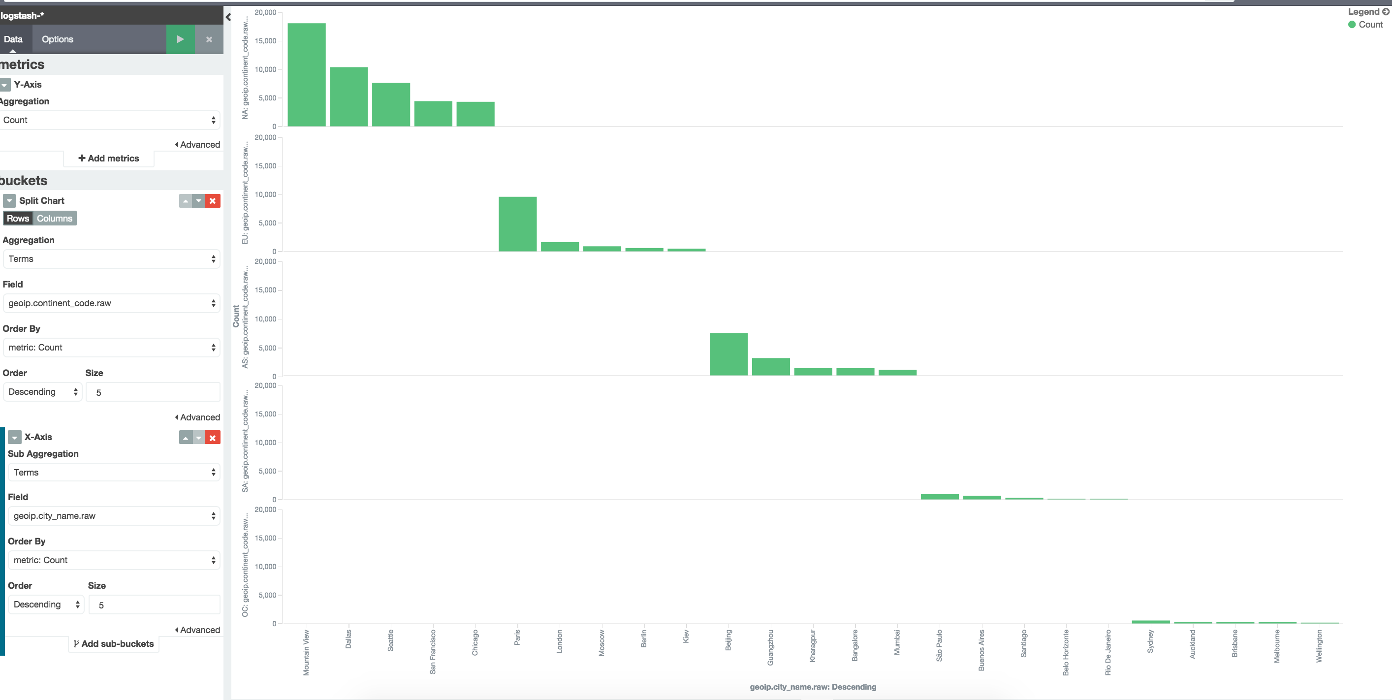
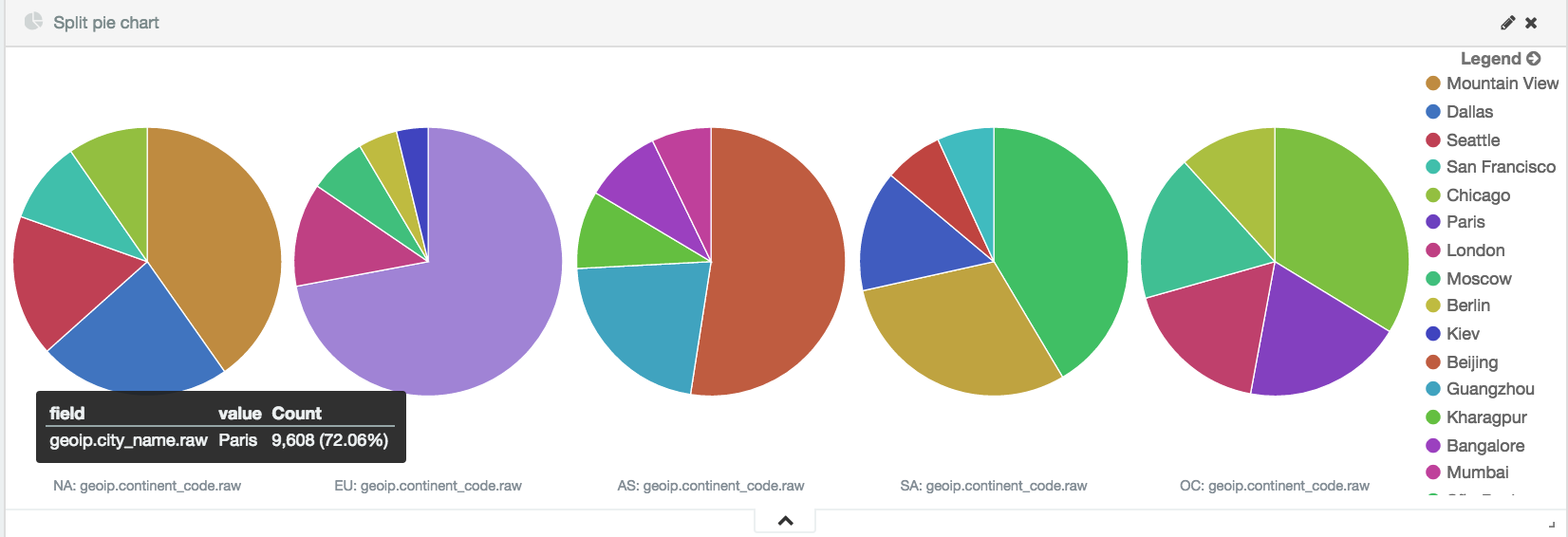
I see what you're saying now. Yeah, it's not possible in the product today. I can see how this might be useful for terms within terms visualization (see my example below). You could try instead doing a split pie chart example, but it's also not ideal because there is only one giant legend to the right.
Apache, Apache Lucene, Apache Hadoop, Hadoop, HDFS and the yellow elephant
logo are trademarks of the
Apache Software Foundation
in the United States and/or other countries.