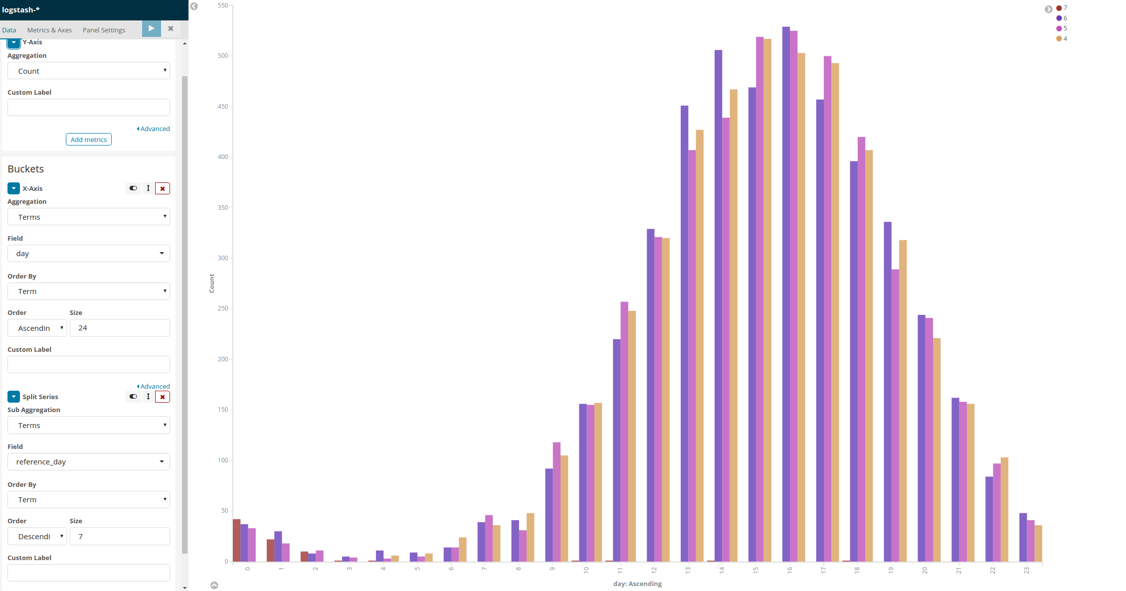
Based on a field value We have to show parallel bars or drop down to display what is the total count or percentage increase/decrease for this field as compared to same day prior week and the catch is Dashboard filter should be on ‘Todays’ only.
Basically we need to show parallel bars containing unique count of a field based on top 5 values of another field for today vs count for same day last week ( comparison todays vs prior week)
The one option that I found to address this requirement is to use timelion graph but I am not finding a way to aggregate data and draw individual bars as above. Even after using stack=false the bars are not segregated and they are coming on top of one another
We are looking for output as per this image
 .
.
The timelion query I am using is
.es(index=index_name, timefield='timeGMT',metric='cardinality:field1',split='field2:5').color(#2f5071).bars(stack=false),
.es(offset=-4d,index=index_name, timefield='timeGMT',metric='cardinality:field1',split='field2:5').color(#36b2b8).bars(stack=false)
Any help would be highly appreciated.