Hi,
I'm working with Syslog data from routers and switches and am trying to make a visualization that shows me what type of message is coming in the most. Like a top 5 message kind of thing so we can quickly see what we deal with the most.
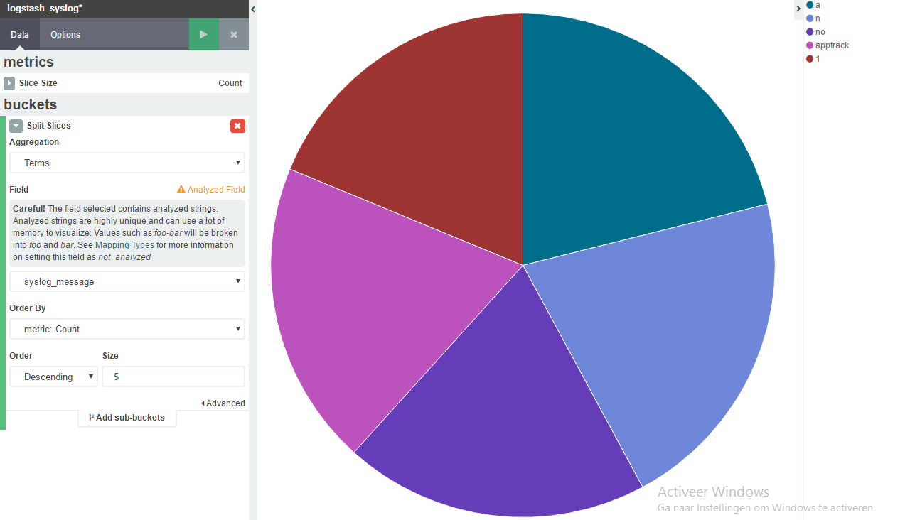
When I try to make a pie chart and split it up based on the syslog_message field I get results, but they don't make sense.
This is what I end up with https://i.gyazo.com/e35a865117295121a3b0d4aaf1fdfea2.png
The message fields include the following which I want to sort it on "APPTRACK_SESSION_VOL_UPDATE", "APPTRACK_SESSION_CLOSE", "CHASSISD_IPC_UNEXPECTED_RECV" and a few more.
The message field is just a bunch of text, but how do I filter it out?