I'm using the sample flights data from the Kibana tutorials, Each log has a 'carrier' field (one of 4 string values), and a 'cancelled' field (boolean)
I want to visualize the percentage of cancelled flights per carrier.
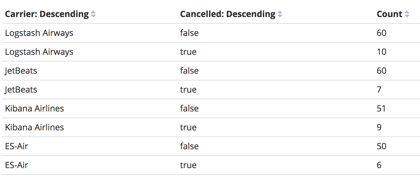
I tried using a table and do the initial buckets according to carrier and then sub bucket according to cancelled, with a count metric i get the amount of cancelled and not-cancelled flights per carrier
however i can't find a way to add the cancelled/not-cancelled ratio
I read about painless scripting language but it seems you can use it to access document values but not my calculated metrics