You are going to need to use a Vega visualization to build this chart.
Try the following aggregation in Dev Tools. This will provide the percentage data needed to build the chart.
POST /kibana_sample_data_flights/_search
{
    "size": 0,
    "aggs" : {
        "my_bucket_script" : {
            "date_histogram" : {
                "field" : "timestamp",
                "interval" : "hour"
            },
            "aggs": {
                "flight_time": {
                    "sum": {
                        "field": "FlightTimeMin"
                    }
                },
                "flight_delay": {
                    "sum": {
                        "field": "FlightDelayMin"
                    }
                },
                "total_time": {
                    "bucket_script": {
                        "buckets_path": {
                          "flightTime": "flight_time",
                          "flightDelay": "flight_delay"
                        },
                        "script": "params.flightTime + params.flightDelay"
                    }
                },
                "delay-percentage": {
                    "bucket_script": {
                        "buckets_path": {
                          "totalTime": "total_time",
                          "flightDelay": "flight_delay"
                        },
                        "script": "params.flightDelay / params.totalTime * 100"
                    }
                },
                "flight-percentage": {
                    "bucket_script": {
                        "buckets_path": {
                          "totalTime": "total_time",
                          "flightTime": "flight_time"
                        },
                        "script": "params.flightTime / params.totalTime * 100"
                    }
                }
            }
        }
    }
}
Then you can use this aggregation request in the vega visualization to build a chart. Below is an example that uses vega-lite to show the flight time perecentage.
{
  $schema: https://vega.github.io/schema/vega-lite/v2.json
  title: Chart title

  // Define the data source
  data: {
    url: {

      // Apply dashboard context filters when set
      %context%: true
      // Filter the time picker (upper right corner) with this field
      %timefield%: timestamp

      // Which index to search
      index: kibana_sample_data_flights
      // Aggregate data by the time field into time buckets, counting the number of documents in each bucket.
      body: {
          "size": 0,
          "aggs" : {
              "my_bucket_script" : {
                  "date_histogram" : {
                      "field" : "timestamp",
                      "interval" : "hour"
                  },
                  "aggs": {
                      "flight_time": {
                          "sum": {
                              "field": "FlightTimeMin"
                          }
                      },
                      "flight_delay": {
                          "sum": {
                              "field": "FlightDelayMin"
                          }
                      },
                      "total_time": {
                          "bucket_script": {
                              "buckets_path": {
                                "flightTime": "flight_time",
                                "flightDelay": "flight_delay"
                              },
                              "script": "params.flightTime + params.flightDelay"
                          }
                      },
                      "delay-percentage": {
                          "bucket_script": {
                              "buckets_path": {
                                "totalTime": "total_time",
                                "flightDelay": "flight_delay"
                              },
                              "script": "params.flightDelay / params.totalTime * 100"
                          }
                      },
                      "flight-percentage": {
                          "bucket_script": {
                              "buckets_path": {
                                "totalTime": "total_time",
                                "flightTime": "flight_time"
                              },
                              "script": "params.flightTime / params.totalTime * 100"
                          }
                      }
                  }
              }
          }
      }
    }

    format: {property: "aggregations.my_bucket_script.buckets"}
  }

  // "mark" is the graphics element used to show our data.  Other mark values are: area, bar, circle, line, point, rect, rule, square, text, and tick.  See https://vega.github.io/vega-lite/docs/mark.html
  mark: bar

  // "encoding" tells the "mark" what data to use and in what way.  See https://vega.github.io/vega-lite/docs/encoding.html
  encoding: {
    x: {
      // The "key" value is the timestamp in milliseconds.  Use it for X axis.
      field: key
      type: temporal
      axis: {title: false} // Customize X axis format
    }
    y: {
      // The "doc_count" is the count per bucket.  Use it for Y axis.
      field: flight-percentage.value
      type: quantitative
      axis: {title: "Document count"}
    }
  }
}
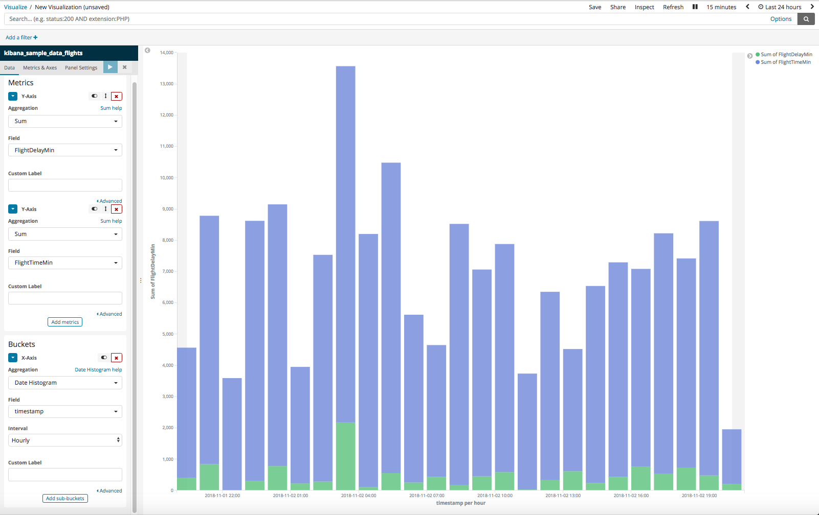
This will give you something that looks like
I think you will need to use regular vega (instead of vega-lite) to create the chart that you are really after. Here is a good example of creating a stacked bar chart in vega https://vega.github.io/vega/examples/stacked-bar-chart/. Try putting that example together with the data from the bucket script aggregation.