
A new color palette for data visualisation was tested in advance in Serverless in November 2024 and introduced as the default settings in Kibana 9.0 in April 2025.
This is part of a larger effort to visually refresh our entire design system. It brings several relevant changes designed to leverage the potential of the new visual approach. With this post, we aim to explain the reasoning behind our choices and the beneficial results we have achieved
Why did we need a new color system?
Over the past few years, there has been a growing desire for a visual update and refresh of our product aesthetic, driven by multiple simultaneous reasons. Our previous color system was no longer effectively supporting the complexity of EUI (our design system). After several years, a desire for a more modern and appealing aesthetic naturally grew. In addition to these factors, the design system was feeling increasingly detached from Elastic's evolving brand identity and communications.
The basis
This post is dedicated to data visualisation colors, but we first need to explain the logic behind the new color system to understand how it works.
Elastic-Charts are based on a color palette of 10 different elements, which are then adapted according to specific needs and contexts.

These 10 colors are the starting point for our Color Palettes. They help our teams handle more complex contexts such as diverging and convergent palettes, textual representation of data or status-alerts across the product thanks to mathematically generated color scales (EUI Color Palettes) and carefully adjusted palette variants.
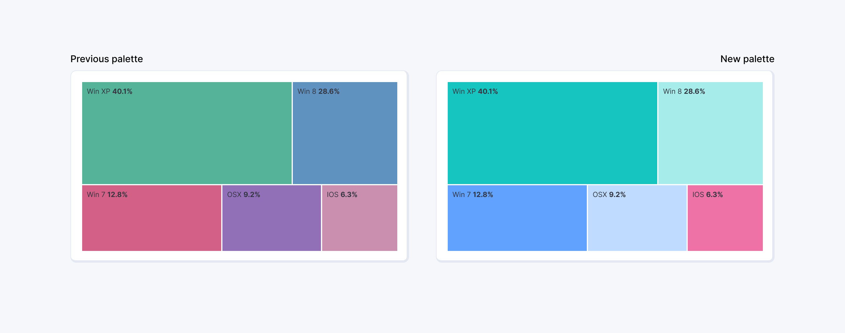
As illustrated in the following image, this update shifts our charts from the example on the left to the one on the right. This is the most evident change when we look at Kibana visualisations, colors are brighter and more distributed even if based on fewer tints of color, but that is just the surface of what changed. Now, let’s get into the details of how and why these colors were selected.
Where does it come from? A new color spectrum
Starting from the Elastic brand identity, the design team generated a new color spectrum that serves as the basis for all color combinations and uses across the product. Buttons, callouts, icons, text paragraphs, and, of course, charts now follow the same rules, as they are all derived from the same set of colors and shades. This allowed us to build a coherent color system that is rigid enough for consistency yet flexible enough to be scalable and applicable to all different use cases of the Elastic Design System.

This set of shades allowed us to build a new color palette that is not picked manually but generated mathematically within the OKLCH color space, this means that every shade (or column, eg. shade 60) share similar values of lightness and chroma independently from the typology of color. These values have been slightly adjusted to accommodate colors features (Yellow tints always require an extra amount of care being a very light and bright color) but they now provide the design team a solid base on which colors can be picked according to context and need, since this creates shades of different tints that have consistent contrast with background and can be easily swapped among each other.
Some examples for light mode, Shade 90 of these tints are normally used for button background while Shade 100 for text tokens since they require higher contrast for accessibility purposes. The same logic has been applied to Datavis colors, with the ultimate goal of obtaining a palette that is solid, flexible while not being detached from the product and the brand, ensuring charts do not look out of place.
The choice we made
We opted for a 10-color palette, formed by pairs of shades (shade 60 and shade 30, or columns 60 and 30) from five different tints: Teal, Elastic Blue, Pink, Red, and Yellow.

Typically, data visualisation palettes use 10 to 12 different colors, so using pairs of shades from the same color might sound counterintuitive. This decision was made to avoid expanding the original color spectrum too much, as that would have required creating additional tints. The result of that would have been a less consistent set of colors that would drift further away from the brand and potentially create a wider range of issues. One of these issues is accessibility, a smaller set of colors is easier to handle and allows us to provide a fully accessible palette in dark mode. All these ten colors have a contrast with background color higher than 4.5:1 (WCAG standards) providing a clear separation between page and chart. In light mode, this same goal is fulfilled by the introduction of High Contrast Mode which will provide accessibility for charts in all cases.
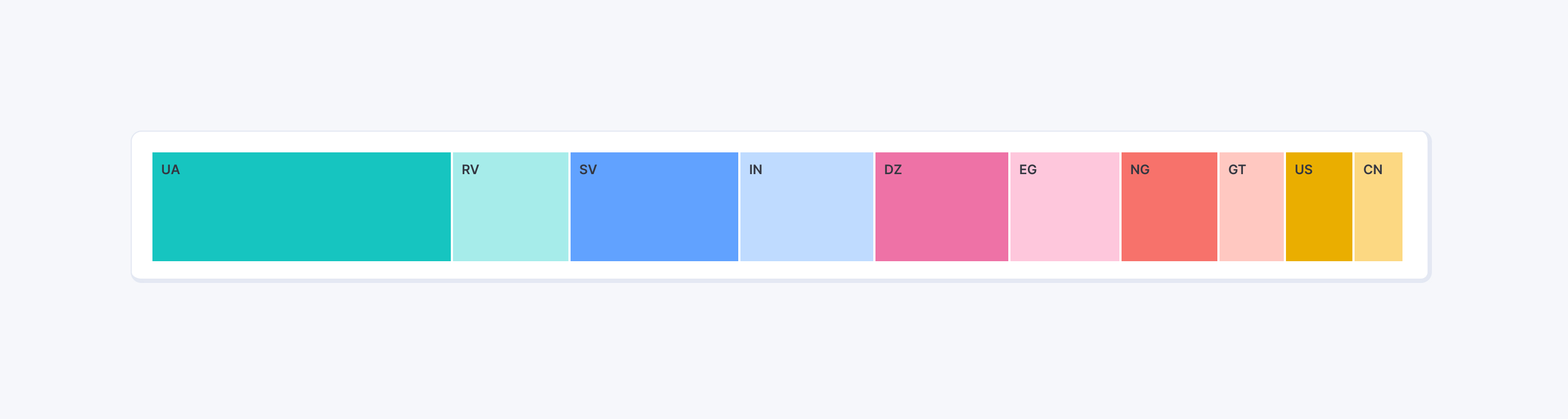
An additional important point is the depiction of adjacent visual shapes. The alternate set of dark and light tones would accommodate this in charts like stacked barcharts, areacharts and treemaps, providing high values of contrast between colors in typology of visualizations that are very common in our product
The following picture effectively depicts the result, showcasing the different aesthetic of the new color palette when compared to Elastic brand illustrations and visual communications. We ultimately filled the gap between the two while simultaneously paving the road for future expansion and customizations.

Scalability
The whole logic behind this new approach to color gives us the ability to expand the current set of options and scale our product UI beyond previous limitations, covering additional user needs that could not be addressed properly before.
In the past years, severity levels were addressed in various ways within the Kibana environment due to a lack of consistent and solid guidelines for dealing with them. The new spectrum gave us the possibility to fix this by using the generated tints to establish a clear set of patterns on how to use colors to communicate different levels of risk across different contexts. The ultimate goal here is, as you can imagine, to offer users a coherent experience across solutions (Health & Severity).

We know this palette is not free from downsides and will accommodate some contexts more than others—unfortunately, all palettes are like that. We believe, though, that this is a significant step forward in terms of logic and structure, and we hope users will appreciate it.
This part of the product is constantly evolving and we keep iterating in order to improve the experience of Elastic users with charts. We would love to hear your feedback, so if you have anything to share, please feel free to reach out to us. We will be happy to hear what you have to say. Thank you for reading this blogpost.