What I was trying to tell you in the other post.... not easy.
You could create a runtime field that would be a new time field that would be the transaction @timestamp + transaction.duration.us and name it end_timestamp or something
then the total duration would be something like.
Max(end_timestamp) - Min(@timestamp)
If that worked then I would probably create that new field on ingest with an ingest pipeline so that is already there.. runtime fields may not scale if this is high volume
Actually, that is a good idea!
If I get a chance later in the week I will take a look, but that would be my suggestion
I do not have permissions to do this in my org. Will have to request it and might take time.
However, I do not really care about last service's transaction.duration.us. A plain Max(@timestamp) - min(@timestamp) of trace just works fine. But there's no way to plot even that.
When you say plot you mean a line chart because I just showed you how to do the table?
And I'll ask you actually. What are you trying to accomplish? Do you want to see it on a chart the longest?...
Because there's probably some other methods line chart fine...
I'll take a look, but if you wanted to run some aggregation scripts or transforms you could probably figure this out. Get your top ones every 10 minutes or whatever
The data is there. You just need to figure out how to get it. And no it's not an of the box thing
I think I told you that in the very beginning.
You can just write a simple shell script that the search with the scripted fields and aggregations and pull the data right out.
Nope, not the simple. Just you are the work a little and unfortunately
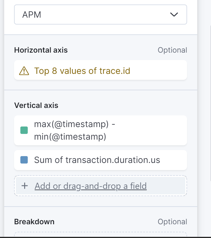
Just to be clear, the top 10 values you showed are not actually top 10 traces with (max-min timestamp). They are top 10 values with max (sum(transaction.duration)). Because they are ranked by (sum(transaction.duration)).
If you change the top 10 to top 100, we will see entirely different values which are higher than the top 10 (high values of max-min timestamp). Because there can be traces with high overall time but low transaction time (because of queuing or some other issue). That's exactly what I want to capture.. whether its queuing or some other time.. I want to find out the traces with highest overall time.
Plotting is next step, once the top 10 table reliably works. When we have millions of traces, just looking at top 10/100 doesn't give us the full picture, that's why wanted to plot.
But as I said plotting is next step, first the table doesn't work.
I would assume this is a fairly common usecase. having asynchronous services conencted over queues where we want to track overall time for a request.
Table: Absolutely Right but that should be pretty close if you ask for 1000 traces with sum max duration and then sort by the max-min you should get a pretty good idea.. if you have services that have small durations but long min max i.e. they sit in queues for a long time that could be an edge case you miss... BUT you may miss that anyways because a message could be stuck in a queue forever so that is another edge case if stuck in a queue forever or VERY long you may not see it.
If you are looking for 100% coverage of all cases then you will need to build some custom queries and aggregations.
Line Plot:
A line plot is an aggregation within a X bucket / histogram with the Y value
Curious What Value do you expect to be the X-Axis? Trace Ids?
With the Total duration in the Y value, I don't think is going to work well... even if you had the data you wanted
I think you are still trying to answer the question "What are the Top Traces by Total Duration" within the last Time Bucket ... I line graph is probably not going to do that even if you had the data readily available
Bar Chart
Typically that kind of Data Set looks like a Top-N visualization something like this Horizontal Bar Graph (Yes this works like the table)
This Bar Chart and the Table pretty much work the same with the added benefit as the Table you can ask for 1000 Rows with top sum(duration) and sort by max-min. Seems like that would be a pretty good start.
If you want 100% accuracy/coverage on Very Large Data sets you are going to read/transform the APM data... then work with it... you could use Python or something or get very good with the DSL.
The Machine learning jobs could look at each service and detect anomalous behavior, that is a commercial, however.
These are my observations/suggestion perhaps someone else with have more / different solution.
Apache, Apache Lucene, Apache Hadoop, Hadoop, HDFS and the yellow elephant
logo are trademarks of the
Apache Software Foundation
in the United States and/or other countries.