get the desired output using sibling aggregations like this:
sample firing alerts output:
Now, how would I visualize that output?
When I see non-trivial aggregations, I think time series visual builder.
But notice that the output is not a time series.
Other than using Vega is there a way to visualize the output of my query inside Kibana?
Or must I use something like Vega or Javascript to visualize my aggregations output?
@anelson-edge unfortunately the standard "data table" visualization doesn't support the bucket_script aggregation and we're tracking support for this here. If you can give this a +1, it'll help us prioritize it appropriately.
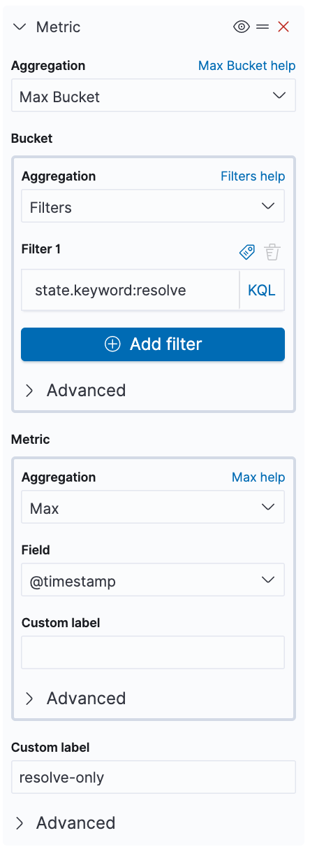
We can get most of the way there using a standard data-table visualization:
Unfortunately, if you need a bucket-script aggregation and aren't using time series data, I don't know of a way outside of Vega to get you what you're looking for.
Well, the data is time series, but I only want the last event (based on the timestamp) for any given alert (alert-key).
And then I only want those last events if the last event is in the firing state.
I think it's a builtin assumption to "Time Series" Visual Builder that I have a time-series for the output (not just the input).
That said, I did learn a new trick from your "most of the way there" example.
Thank you for responding.
I will learn some more Vega, but unfortunately there are known issues with the Kibana Vega integration (no scrollbars, no vega 5 support yet) that make Vega not quite perfect.
Apache, Apache Lucene, Apache Hadoop, Hadoop, HDFS and the yellow elephant
logo are trademarks of the
Apache Software Foundation
in the United States and/or other countries.