hi, need help to see if 2 charts comparing results of 2 different fields can be merged into one
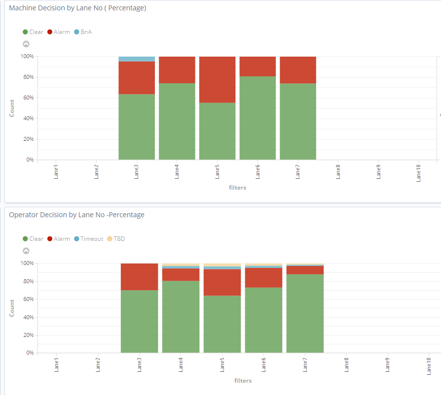
I am currently comparing the machine and operator disposition performance by 2 different charts using Kibana as below Basically all parts tested by machine will also be tested again by operator whether they pass or fail on the same lane.
Is it possible to merge into one chart as below . I am okay to not compare between lanes
THe discover page looks like this. Basically, I have filtered the type field to relabel as lane number in the above chart
The PVS_OPR_DISPO is what I use to create the Operator disposition chart while the Machine_Dispo is used to create the Machine dispo chart.
Hi,
It should be possible, depending on your data.
What I would do:
- Make a Horizontal bar chart.
- Set that count percentage on the X-axis.
- Split by a field that determines if it's Machine or Operator. If that doesn't exist an can't really be created, a Filter aggregation could work as well. If it's with KQL, this would be the syntax:
PVS_OPR_DISPO:* for the first filter and Machine_Dispo:*for the second one.
4 Then you can do a split series by Decision type, just like the in first charts and set it to stacked.
thank you . Managed to get the below chart with your help.
That looks good. If you also want to see different lanes, adding an Input Control visualization on the same Dashboard as this visualization can let you select a specific lane and that will filter the whole dashboard to the lane you want to see.