Hi guys,
I'm a student and I need help to visualize in a visualization the status of my system (if it's up or down) like the pics below or simply with a text "UP" colored by green if the status is ok or "DOWN" colored by red if the status is nok.


My question is:
using heartbeat and into the specific the "monitor.status" param contained into the json returned from the beat, how can I do to check the real time status in a interval of 20seconds for a specific IP?
The unique solution i found is was obtained using a pie chart with these data options
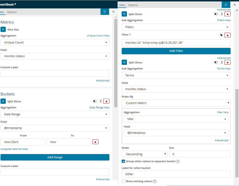
but I obtained 3 layers on pie chart and in every refresh (setted by options in dashboard) the color of data-range layer changed automatically.

Thank's in advance