There's no current element for this, although it'd be a good idea. For a non-map based solution:
SVG has a neat getPointAtLength in combination with getTotalLength so you can map from ratio to length
Here's an example for its use (it interpolates etc. but the gist of it is there)
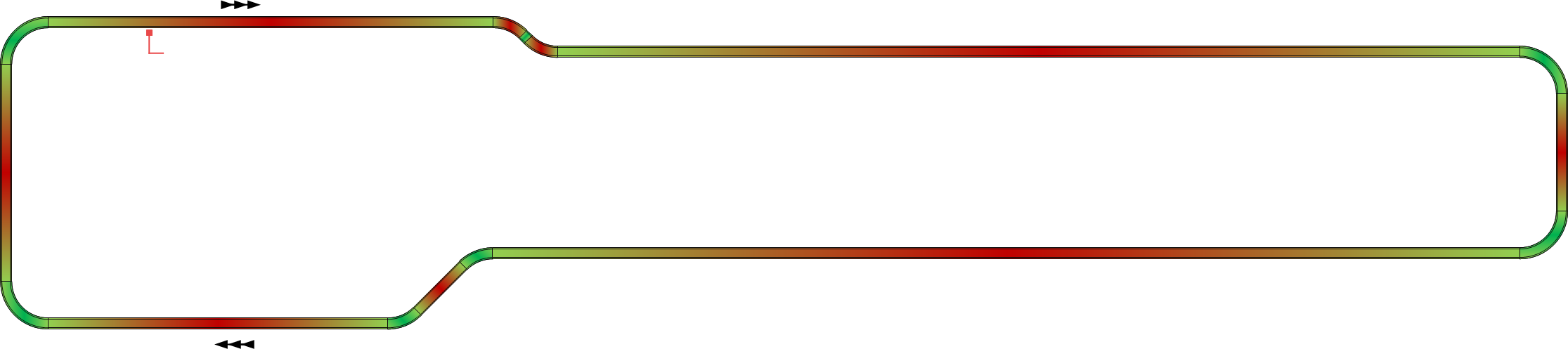
As you want to color sections of the path, you can use stroke-dasharray, a great example, also from Mike Bostock, is here
The static example shows various sections in a different color in heatmap-style. This needs as many dashed paths as the number of unique heatmap colors; each would be filled where the color applies, and would have a gap where the color doesn't apply, so layering the paths for all colors over one another gives you what this example apparently needs.
The example also has dark, thin color separating lines between adjacent sections, this could be done similarly, with one additional layer on the top for the black color, using very short dash line sections.
If the sections are of fixed length, and there are not too many sections, then, instead of using as many paths as the number of distinct heatmap colors, it can be done with one path per section. In this case, doing gradient coloring, if needed, may be easier to figure out.
You can add markers along the path too, this way.
Calculating percentages, you may be able to bypass the need for multiple paths at least for straight stretches, and just get away with using linear gradient colors. While gradient colors are typically, as the name suggests, gradient, discrete color changes are also doable.
If you need to use a map projection, then it's still the same as above, but you also need to first resample your curve, because the straight line on the Earth's surface generally doesn't map to a straight line on a cartographic projection, ie. additional points need to be added, and their projections calculated, before doing any of the above. For variety's sake, here's a great example by Mike Bostock.
As there's no current element type for this, please see Rob Bruce's HTML plugin for now, he created custom SVG at Crimson Macaw for UK airports.
The plugin format is currently undergoing some changes, I'll have a recent meetup talk uploaded in a couple of weeks, will link it to this conversation too.