Hello,
I just started to use ELK and I want your help with issues.
I have a dataset with the following fields
Username,Name,Recruitment_date,Recruitment_year,duration_at_company,leave_date, leave_year
and I want to find the number of employees for each year. So we want
for year in years_set:
Recruitment_year<=year and leave_year >= year
My first issue is how I can write something like the above command to kibana. It is easy for a given year using a static query but I want it for every year.
My second issue is that I wonder if there is any way to deal with dates or generally values of dates that don't exist.
For example,at the following diagram I want to find the average duration of employees per year of recruitment. But at 2011 there isn't any recruitment and we have a continues line from 2010 to 2012. Instead I would prefer to have a zero value for 2011.
it would be helpful to know whether you want to visualize the data using Kibana's visualizations or extract them as JSON via Elasticsearch's http API and use them in another tool. I will assume the former for my answers.
For your first question I would suggest to add a scripted field of type number called employed_years to your index defined as
which holds all the years that the person was an employee. Then you can use that fields e.g. in histogram or terms aggregations to get the number of employees.
I will get to your second question in a short while in a follow-up post.
The wording of your last paragraph suggested that you intended to show an example of the diagram. That might indeed be useful to help my understanding of your problem.
Look for example the following picture. For 2010 and 2012 I have some values which give me information for these years, but for 2011 I don't have any value/record. So I would like the value of 2011 to be 0. Instead there is no value for 2011 and the line just piece together the values of 2010 and 2012.
Ok, I see what you mean in regards to missing values. By default Elasticsearch leaves out empty buckets and Kibana's line visualization just connects the non-empty buckets. If you are using a Histogram or Date Histogram aggregation on the x-axis you can force Elasticsearch to also return empty buckets in between by specifying {"min_doc_count" : 0} in the advanced JSON Input field of the aggregation:
Since the data are not continuous anyway, disabling the line and just using the dots or switching to a vertical bar chart might also be appropriate here.
Regarding the ratio: Scripted fields can only access data from a single document at a time. It is therefore not possible to use them to calculate such a ratio. By combining several pipeline aggregations it should be possible to let Elasticsearch calculate that, but those aggregations are unfortunately not yet supported by the visualization editor.
This worked changing Int to Long
LongStream.range(doc['recruitment_year'].value, doc['leave_year'].value).toArray()
It was a false error. Thanks you a lot for your help.
If you can suggest any way to visualize the ratio I would be grateful.
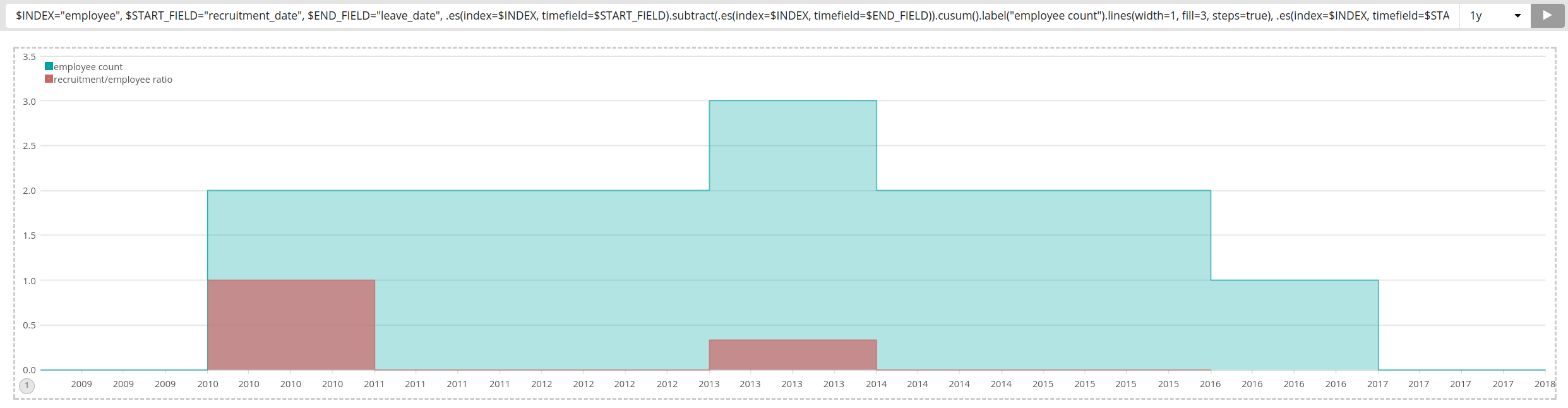
I was able to produce something that might match your requirements using timelion. It contains both graphs in one, but could obviously also be separated:
Apache, Apache Lucene, Apache Hadoop, Hadoop, HDFS and the yellow elephant
logo are trademarks of the
Apache Software Foundation
in the United States and/or other countries.