I am currently trying to create a graph that shows the frequency of response time within given intervals (i.e. every 50ms) and split the series so that one line is the data for the last day and the second line is the average frequency for the past seven days.
So far I have been able to create this for a single day of data:
When I split the series by date (my two date ranges are 15 Jul-22Jul and 22Jul-23Jul but I am using date math expressions to get this i.e. now-2w/w) the graph shows the 'week' data much higher because it's the total frequency and not the average frequency over seven days. Effectively I want to divide every value by seven:
Hi Nathan, it's not clear to me what structure the input data has and what the visualization setup is, so I'm in the blind and in any case, don't have an immediate suggestion other than trying it with TSVB.
Hi Robert, thanks for your reply. My apologies for not making my input data structure and my visualisation setup clear.
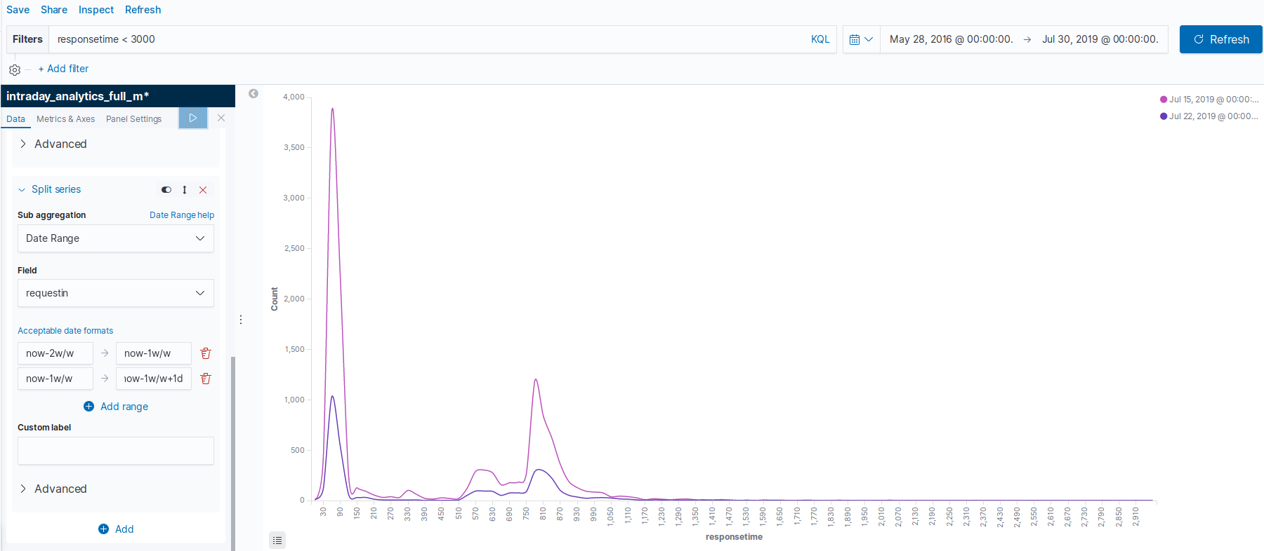
Every document in my index has a field with 'responsetime' which is stored as a long. Response time is being measured in milliseconds. I have filtered all my data to only include documents with a response time of less than 3000 milliseconds because any extreme values affect the histogram by not allowing me to create interval sizes smaller than 300,000 milliseconds:
I think my issue is that I want to plot two lines measured by different metrics but plotted on the same scale. The blue line in my graph from the original post should be the count of response times in each interval of 30 milliseconds from 0 to 3000 for one day. I am filtering this specific day using the date range sub aggregation in split series. I have used weird dates due to the timestamps of my input data but the concept is to have one day and then the previous week as the two ranges (see screenshot below):
The green line should be average count of each interval for a week's period. For example, say the 90 millisecond bucket has a count of 6300 for the entire week (green line), so to make it comparable to the single day (blue line) I would want to divide the bucket by 7 to get an average count of 900. Note that I am averaging the count of each bucket and not averaging the response time itself. The idea is the distribution should how varied the response time is on the day compared to the entire week.
Unfortunately I don't think the TSVB will help me because my X-axis is a histogram of the response time values from 0 to 3000 at 30 millisecond intervals and not a date-histogram.
After consulting with other developers, I think it's not currently possible out of the box, so probably another way to solve it would be through data pre-processing that yields a suitable shape of the data to be rendered. Elastic is working on Data Frames for batch or continuous data transformations for future releases, maybe this use case is covered. Also, maybe rollups would work - both of these options precede Kibana in the processing chain.
Also, it may be possible to use Kibana Canvas, where queries can be written in a (limited but growing) version of SQL, and also, timelion queries can be used. While more, and more flexible chart types will be added, it's worth checking if the current ones are sufficient to render what you need. But the key part is that either via appropriate querying, or the use of the expression language - or both - it's possible to bring the data to a format from which a simple, unassuming chart can directly render.
Yet another option is to set up a visualization with Vega inside Kibana, which gives a lot of flexibility, via its powerful data transformations.
Apache, Apache Lucene, Apache Hadoop, Hadoop, HDFS and the yellow elephant
logo are trademarks of the
Apache Software Foundation
in the United States and/or other countries.