//this article is written as part of a response to github issue on dashboards which is tracking what do to with time-series data on single digit wigets.
Dashboards!
Why do dashboards exist In Observability?
Dashboards provide quick views of important information to help determine if further action is needed. (references below)
What is the difference between business service level dashboards and host level dashboards?
• Business Services dashboards are a view of business KPIs (are transactions performing in a normal range? Is business volume typical?) and an aggregate view of the underlying technology (my uptime and overall system’s health).
• Technology dashboards provide detail views of the metric-generating components that underly a business service and allows for a detailed look at attributes that impact current or future performance and health.
The remainder of this discussion is centered on technology dashboards and host level views. Business Service dashboards are a different animal.
In viewing host level metrics there are two general groupings: multiple systems – typically of a similar function (web, services, DB) – vs. a view of a single system.
A closer look at how best to utilize metrics at a host level. We typically visualize metrics for one of two reasons.
- I want to see what is going on now. I need to see real-time metrics during an important release activity or during an incident recovery.
- I want to understand the trending behavior of a system. For example I may be looking for performance changes over time or working on setting compute resources to actual needs.
These two views of metrics are different and both important and each has its challenges when it comes to displaying data. When viewing the ‘Latest’ data, we need to know about its precision (is it averaged or point-in-time? over what period?), its actual collection interval (1 sec, 1 min), and any lag between ‘now’ and when the data was collected (is it truly the ‘latest’ real-time or just ‘near-time’?). When viewing trending data we need to show normalized information as well as important data that identifies behavior that may be buried by simple averages.
Note: an important consideration for monitoring is choosing a meaningful interval for raw data collection. In some cases this may be reviewed per host, per metric and even per app component. For Disk, 10 minutes may be perfectly acceptable for established, mature environments but not necessarily safe for systems with immature processes and rapid changes – or for systems where disk usage is vital to the stability of the system e.g. database environments. Similarly, for Memory and CPU a default interval of 10 seconds may be fine grained enough, but for some systems 60 or 120 seconds may be more than adequate.
Visualization Concepts for Elastic Observability
Much of the following is discussed in the github development conversation above; I’m distilling it here with some context where necessary.
When dealing with single number visualizations
• Values should be labeled as either Averages or Last Value because Averages <im a bit confused by this, is it just never equal?> Last Value. When showing a single value without a label it would be assumed to be current or ‘last value’ data – but averaged data should always be labeled.
• Some values will ALWAYS have a last value. There is no such thing as non-existing Memory count. Note: this is indeed a technical issue Elastic acknowledges and is being worked on.
• Some values should ONLY have a last value. There isn’t a need to average disk space over the last 15 minutes. Disk usage is a discreet number that typically has concrete boundaries.
• ‘Last value’ datapoints should indicate time offsets from ‘now’ as: current timestamp – last value timestamp = time offset in seconds. Since each datapoint could have different data capture intervals this time offset value may need to be indicated per visualization.
When dealing with time-graphed data
• Averages and trendlines are useful data points and can help a user see through the trees. However Averages do not always tell the full story. The following is written around the CPU example but is often applicable to other metrics.
By its nature CPU usage is already averaged out when the values are collected by beats/agents. When CPU metric data is collected the data is the average of the metric over the collection interval. Important concept: we should not RE-Average the metric unless absolutely necessary. Whenever possible the most detailed information should be displayed. When data buckets must be collapsed due to extended time period views we must show top and/or bottom values in addition to time-bucket-averages. Why? Because by RE-averaging data we are dropping possibly very important behavior information about metric spikes within a time-period.
• ‘Help! my important data has been buried in an average’ – this has been shown to be a problem in many time-span graphs across Elastic where an averaged value mistakenly hides very important peak and valley values. You can see this problem when you zoom into an averaged time period only to find very peaky performance that is unknown if you were to only look at a larger interval of data. E.g. Stack Monitoring has this problem when showing JVM Heap where looking at a small time period I see heap usage moving from ~4.5 GB to ~18.6 GB whereas if I zoom out I see usage evenly riding at just around 19 GB.
Lets take a real-world example
The following graph was made from using the same Windows perfmon counters that Beats use (Windows perfmon metricset | Beats). The graph includes counters captured at 1 second intervals and 10 second intervals. CPU usage was controlled through SysInternals CPUSTRES tool.
In the graph you can see that the CPU usage average line at 10 second intervals can show wildly different behavior when the CPU usage gets ‘spiky’ in the later stages of the test. Although we do see the average going up and down, given a perfectly timed CPU stress behavior we can force generate a smooth average line to match the behavior in the earlier stage of the test. What do we learn here? Averages can bury potentially important metric behavior.

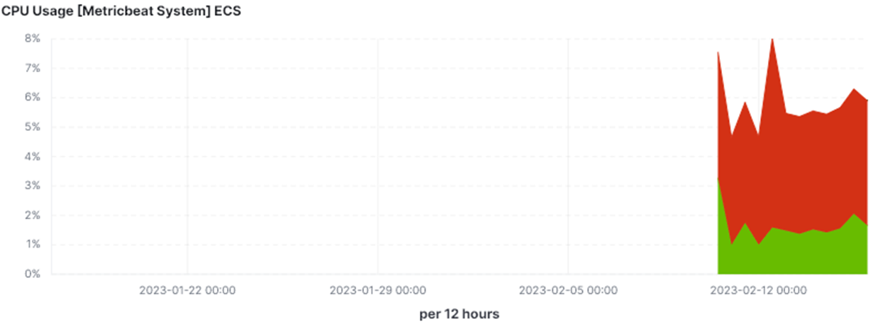
Now lets take this to the next level. Here is the same data (same system, same timeframe) as presented in Elastic Kibana’s [Metricbeat System] ECS ‘Host Overview’ dashboard.
• In the first graph we see the raw data at 10 second intervals – which is the default interval in Metricbeat.
• In the second graph we see the same data, as reviewed in a zoomed out view over two days – and the data grouped in 30 minute buckets. The averaged information (~48% max) hides that the CPU had times of much more use during that bucket period.
• The third graph is even worse when the data is grouped in 12 hour buckets and the CPU appears to never rise over 8% usage.


How do we deal?
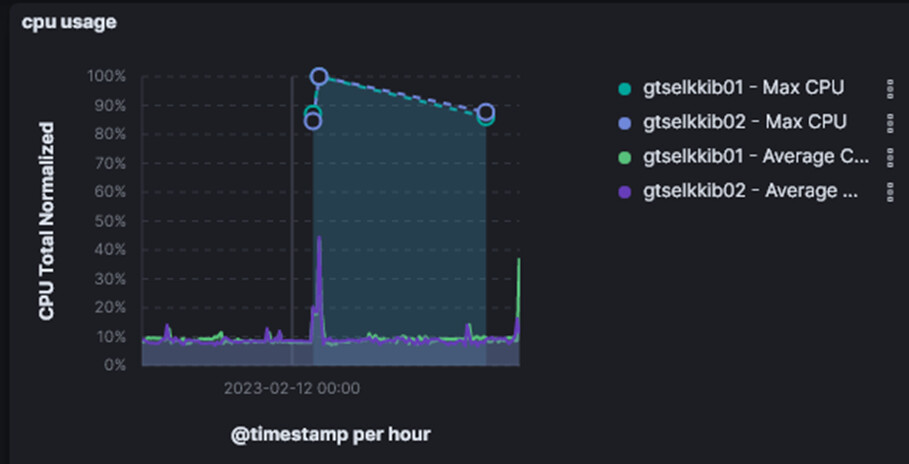
We show both Average and Max – for example in CPU we show max CPU if > 80%
dashboard references
https://www.opservices.com/dashboards-empresas-de-tecnologia/