In Visualize Mode, Visual Builder (Time Series), Line Chart and Timelion Chart are available to the users for building time-series visualizations. As I am new to Kibana, I would like to welcome the community to share views and experiences working with these charts.
Questions:
-
What is the difference between these chart types in terms of sophistication level of analytics and visual customization?
-
What is the determining factor for choosing one chart type over the others in the context of building time-series visualization?
Tabs: Data, Panel Options, Annotations
Special Feature: can switch between 6 different visualization types

Tabs: Data, Metrics & Axes, Panel Settings
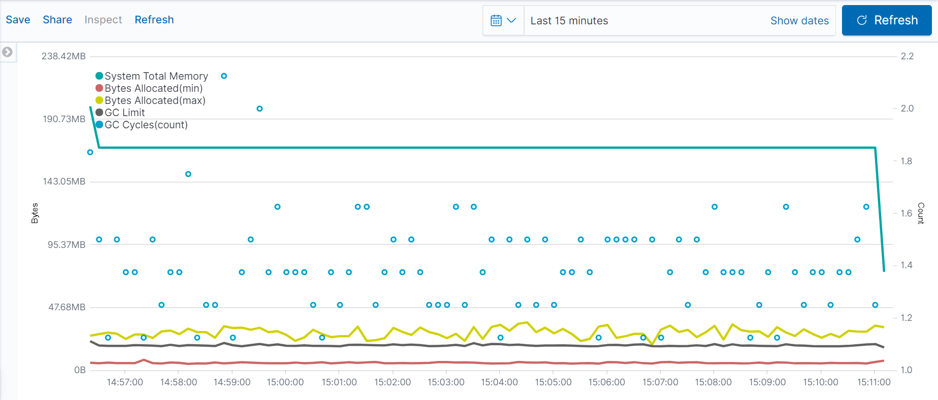
Special Feature: can filter query by Kibana Query Language (KQL) / Lucene, can inspect data

Tabs: Interval, Timelion Expression
Special Feature: inline documentation