Hello!
I've set up search that pulls out OS versions from VPN data feed. All working as expected.
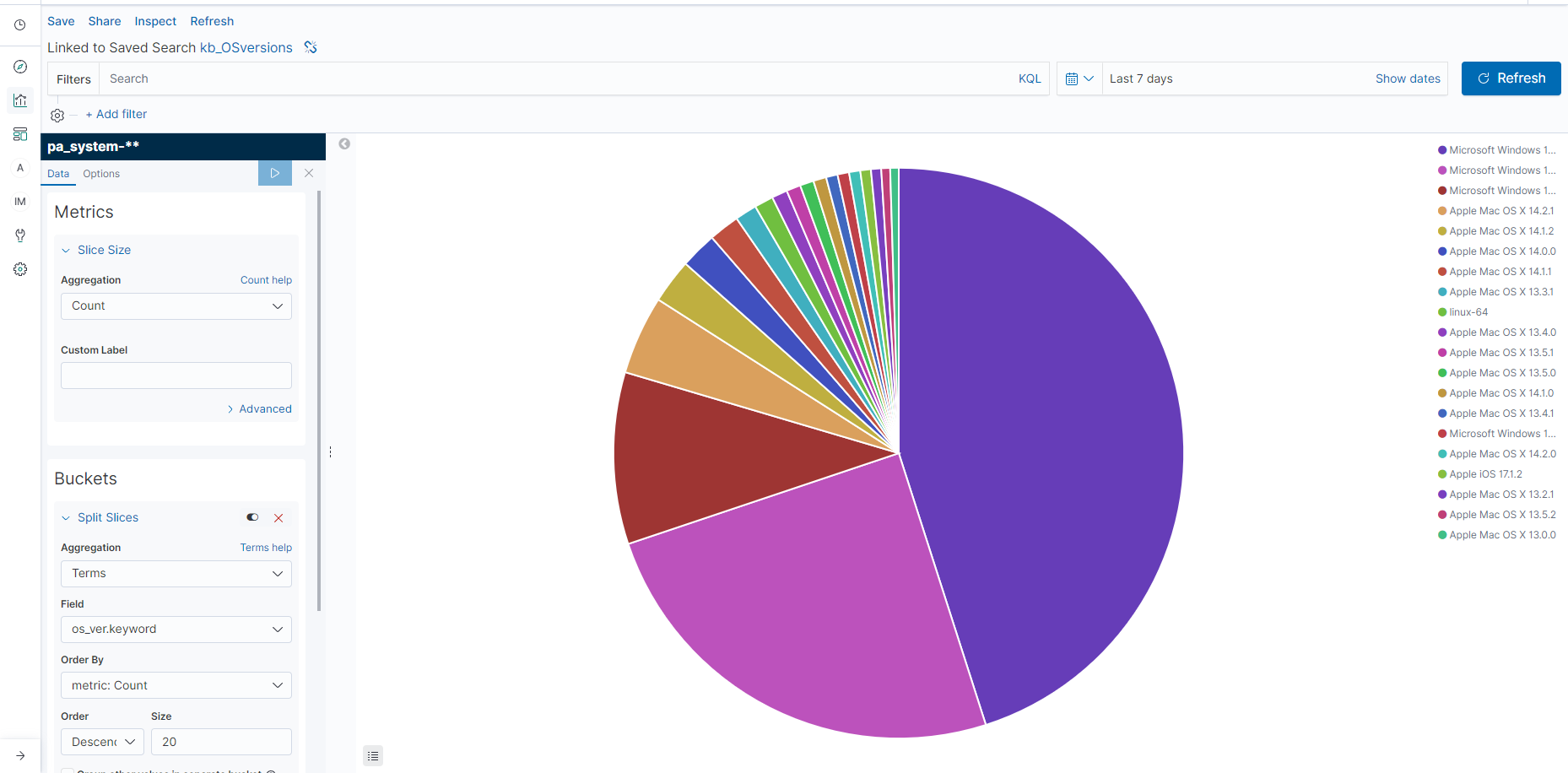
Then I created pie chart showing count of OS versions, again, so far so good, please see attached.
Issue: There are multiple wordings for same value , for example, "MacOS X 14" and "MacOS X 13".
Desired result: to be able to group OS by major categories, for example:
- Windows 10
- Windows 10
- MacOS X
- Android
or should the business need arise:
- MacOS X 14
- MacOS X 13
- MacOS X 12
etc.
Hello @KaBergmanis, welcome to the community!
If I understood correctly, you probably want a filters function.
In this case, I grouped the data based on whether it is Cairo or Dubai, considering them as one group, and Abu Dhabi or Istanbul as another group. You can observe that the values are divided by these groups instead of by Cairo, Dubai, Abu Dhabi, or Istanbul.
Hello,
thanks for feedback, though I'm at loss a bit - I just don't see anything looking like your fields in my page. Am I looking at right place?
Buckets -> Split slices -> select the filters aggregation. Then add your filters.
Great, thank you, that got me my results!
Mistake was that I had grouped them on significant term, so filters option wasn't available - when that was removed and filtered by os_ver.keyword, it worked like a charm.
You're welcome. Glad it worked!