Both these graphs contain the same queries(kb3) or filters(kb4). I know there are github tickets open for a few items like color and other items. I appreciate all the work on Kibana 4..I like the discover and visualizations and what not. I like the highlight over the legend functionality. I'm sorry devs, but as it sits right now, the dashboard is practically worthless, to me at least. I can't even tell what data is what at a glance, which seemed to be the point of a dashboard.
Since this is home I can limp along and maybe install test builds. Thank you.
Complete lack of color control. I have screenshots of colors changing after opening/closing the browser with no change in setup or data..there's no rhyme or reason to it.
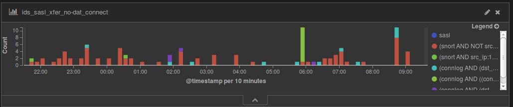
Legend is a joke...seriously....just look at the KB4 shot...I have no idea what is what...I'll have to hover over almost all the filters to figure out what it is...why was the ability to label these taken away? Why use the filter as the label? Why can't I choose the placement of the legend?
I don't want to see @timestamp because I lose screen real estate...why is this here now? Why can't I control if it's here at all? It worked great in KB3 with having it with the legend...why the change?
Why do I have the count on the side? I know it's the count...why can't I remove it?
What happened to the lines? I WANT the lines...the make the graph easier to read by both count and time. Why can't I choose if they appear or don't?
Why can't I change the title of the graph like before? Yes I know it's based on the visualization, but still...why can't I change it now?
Here's an example of one of my filters:
(connlog AND (dst_port:25 OR dst_port:465 OR dst_port:587 OR dst_port:993 OR dst_port:995 or dst_port:9000) AND dst_ip:x.x.x.x AND orig_ip_bytes:<480 AND NOT history:S)
Using this as a label....yugh...bad scene.
I can no longer just glance at this graph and know what's going on. The KB4 graph is no longer useful for a dashboard. I realize that a good portion of these are in github with tickets. What's just amazing is that color and customizing the axis labels github are called "enhancements", but they came built into KB3. How can you remove a feature from a lower version, and then when the newer version comes out and that feature is missing, call it an "enhancement"? It's incredibly frustrating. The only reason I'm even looking at this upgrade is because I want to be current with logstash and elasticsearch.
All this being said, here I am...just some user schmuck complaining about free software. I KNOW you folks bust tail on your software and are obviously much smarter than I am. Just understand that someone somewhere might be using a feature that your team may not think is important and remove
Apache, Apache Lucene, Apache Hadoop, Hadoop, HDFS and the yellow elephant
logo are trademarks of the
Apache Software Foundation
in the United States and/or other countries.

 Well...here's a list:
