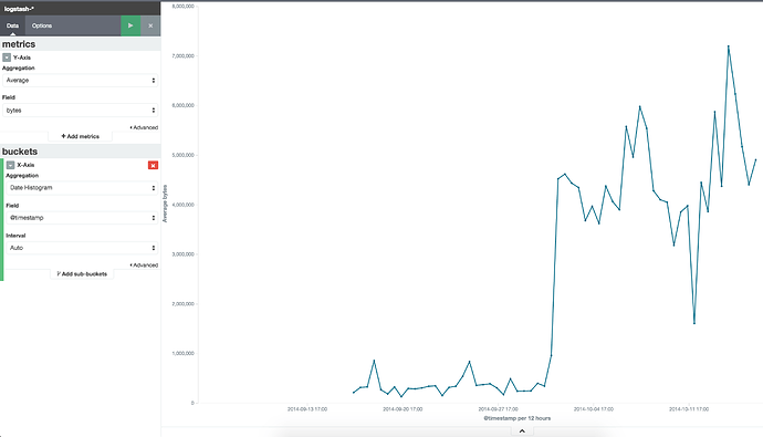
I have network related statistical data. Using which I am calculating network load. Say for example (packet ip + packet op) per time unit.
When I plot the graph in Kibana, on Y axis I see all aggregation functions like count, percentile min, max etc. Instead of those aggregation functions I simply want to see network load per minute/ second.
Note: To calculate network load I have created scripted field in that index.
Does anyone has any idea to plot a graph in Kibana with the field value(scripted/non scripted) on Y axis and time on X axis (time interval can be daily/weekly/per second/per minute )?
