Hello. I'm trying to make linear visualization with average workTime per document and max workTime throw all index. I have two dates: start and end process. So i created scripted field doc['end_time'].value.toInstant().toEpochMilli() - doc['begin_time'].value.toInstant().toEpochMilli()
and made avg y-axes for this field.
But i can't understand how to draw max value of index.
I need chart like this:
Hi,
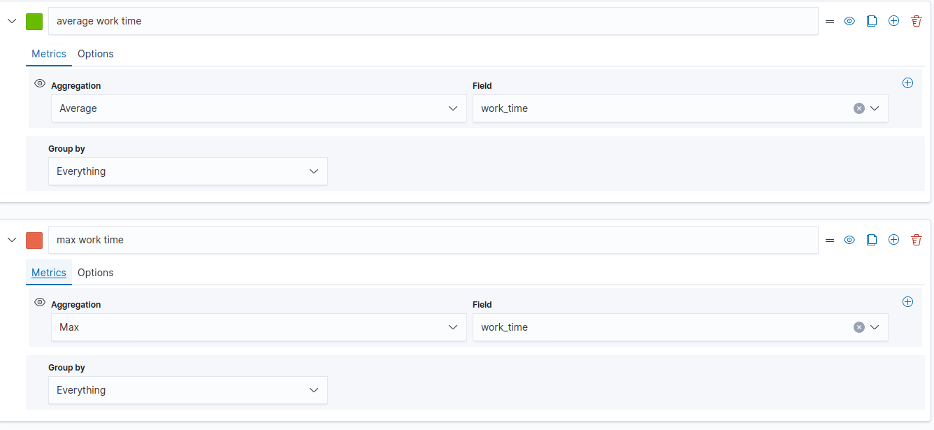
you can use TSVB for that case: create the first average workTime series as you have already did.
then you create a new series for the maxworkTime and you have to overwrite the time interval settings to a value greater than the current time window (for example if you are looking for a 5 mins time interval, you can set the interval to 1 hour for example.
Hi,
Does TSVB support scripted fields to visualize? Or I need to create a new numeric field in the document and fill it.
My scripted field in index has numeric type. And I can use it as filter in TSVB.
Apache, Apache Lucene, Apache Hadoop, Hadoop, HDFS and the yellow elephant
logo are trademarks of the
Apache Software Foundation
in the United States and/or other countries.