Hello. I have been trying to create a gauge-based dashboard visualisation but it appears that I am unable to oder it, either by count or by the metric keyword.
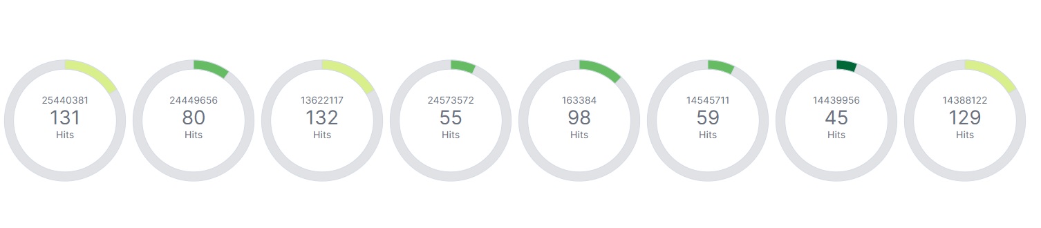
Please see attached image. I would have preferred it to be in descending order by hits.
Not sure how are you setting up that chart, but both in Lens and the legacy aggregated visualizations you can order break down by the metric or the alphabetical value of the condition to break the values
On this Lens chart of the eCommerce sample dataset, the metric type is rendering the average of products.base.unit_price break down by geoip.continent_name.
I can order the charts by the metric (average of the price) or by the continent name (I can even use a custom criteria).
There is no option whatsoever on the gauge type. You showed a different chart which is why you have those options. On other chart types, such as bar graph, I can easily order by count. On the gauge type, however, I cannot see where that option is. I may be missing it, but I do not see any control with which to set the order. Maybe I'm creating the visualisation in the incorrect order perhaps? I am new to this so please bear with me. Thanks.
Apache, Apache Lucene, Apache Hadoop, Hadoop, HDFS and the yellow elephant
logo are trademarks of the
Apache Software Foundation
in the United States and/or other countries.