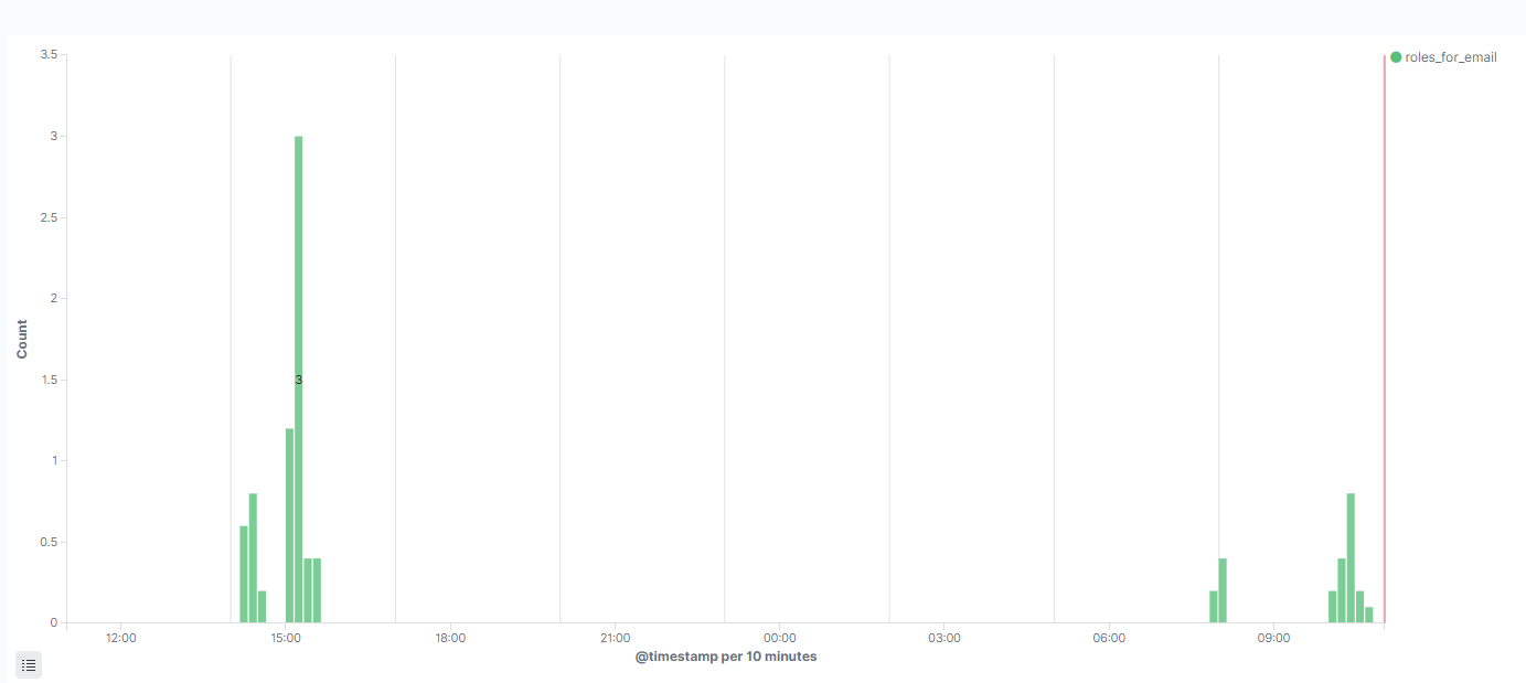
I have created the below visualization which counts the calls to each endpoint in an api, currently only "roles_for_email" is used:
I'm trying (and failing) to figure out if there is a way to show when the version of my docker container image changes and overlay it on this graph. I want this so that when using this as a dashboard I can easily look and see if something happens after an update to the container version.
I have used a dissect filter to extract the container version into a field "dissect.container_version" so i have access it to it. Now I cannot figure out how to
- show the version on the graph
- show only when the version changes