I'm starting to develop a plugin that adds a feature in table vis: a comparable percentage of a metric value based on a time offset. The idea, basically, is show the difference between two time ranges (e.g.: today vs yesterday, today vs last week, etc). To clarify, this is what the table would look like:
In the example above, the second column is the sum of the metric1 for a specific time range (e.g.: today) and the percentage is the difference based on a specific time offset (e.g.: yesterday). So, in the first row, today's value increased 23% from yesterday. Both time range and offset would be configured by form parameters (something similar to date_range aggregation form).
About the plugin development itself: I started studying some examples from tutorials and source code, but I still have some questions:
Firstly, should I develop a hack plugin or a new vis plugin?
For the request, I'm considering "injecting" an date_range aggregation in the query, but I couldn't find any example of this approach. What would be the best way to do this "injection"?
For the response - considering that I'll use the date_range aggregation - I wrote a basic ResponseHandler that extracts the comparable metric value (yesterday), calculates the difference, inserts it in the original time range value line (today) and deletes the date_range aggregation. Finally, I use the aggResponse.tabify to build a table response for the visualization. I was able test this solution adding the date_range aggregation manually. Is this the best place to modify the response? Should I implement this in the esResponse instead?
In the visualization side, I simply added a "comparable" value in the table cell rendering function.
So, basically I'm thinking about injecting a date_range aggregation in query and handle this in response, it shouldn't be visible to the user but it should be configured from custom form parameters. I'm currently changing the source code to test the solution above, but the idea is to turn it into a kibana plugin later.
Any ideas on how I could implement this functionality?
In my opinion, the top-level aggregation should be a date histogram with a fixed bucket size. Elasticsearch will then do the hard work for you. You just add a derivative sub-aggregation and you'll get a delta of the metric vs the previous metric.
It'd be a lot more straightforward to present the comparable value as a separate column in the table. Maybe not what you had in mind, but that would work for 99% of the use cases, I'm sure.
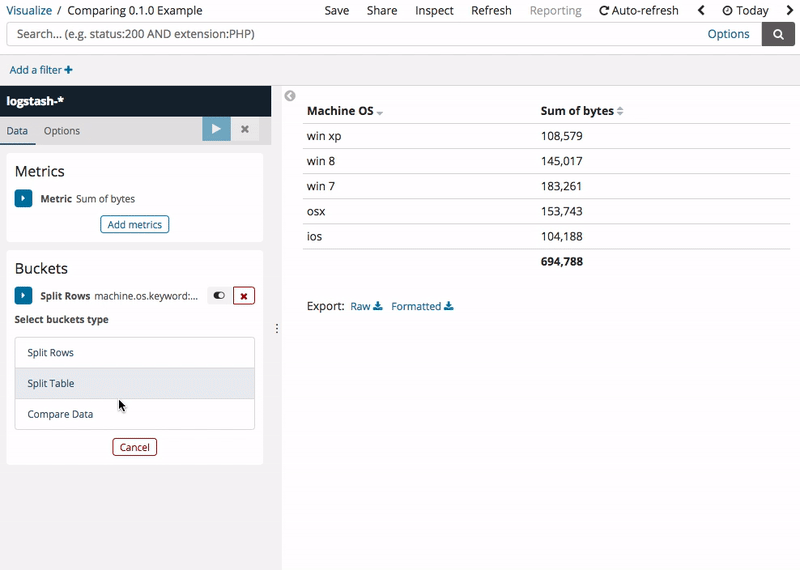
See this example of a data table you anyone can create today (I'm using 6.2.4) that has a derivative metric for the "comparable" value. The time offset is controlled in the date histogram interval size (I used Daily):
Thank you for your time and support helping me out with this! About the date_histogram + derivative approach you suggested:
It works well for complete interval comparisons (e.g.: a whole day vs another), but in the most cases I want to compare a period of day only (e.g.: the first 12h of yesterday vs the first 12h of today). That's where date_range is helpful (but derivative metric aggregation works only with date_histogram).
For longer time ranges, date_histogram sometimes rescales the interval - because the selected one creates too many buckets (e.g.: now-2y/d ~ now time range, interval set to day and rescaled to week). Because of this, it wouldn't be possible to compare distant dates, like today vs the same day two years ago, for instance.
I've had some progress since my first message, and here's what I did so far:
For the request, I've created a new BucketAggType that is a clone of date_range aggregation, but with different form inputs:
The last field (-1d, in the example above) sets the offset for the comparing date ranges. Using dslName: 'date_range' and overriding the write function of params, I was able to convert the form values into a date_range aggregation format (the request for the example above would be "ranges": [{ "from": "now-1d/d", "to": "now-1d" }, { "from": "now/d", "to": "now" }]).
In my plugin initialization method, I'm inserting my new BucketAggType into the AggTypesIndexProvider list. I also change the editorConfig.schemas from every VisTypesRegistryProvider element in order to deny the use of this new aggregation in other visualizations (for now, it's only allowed in table vis).
As mentioned in my first message, I wrote a basic ResponseHandler to modify the ES response and send it formatted to table_vis.
In the visualization side, now I'm considering adding the comparable value in a separate column, just as you suggested. I may have to change the ResponseHandler in order to add this column to the response object, right?
What do you think about this approach? Maybe next week I can publish some code in a Github repo (a beta version or something). That would clarify the topics above a little bit, I guess.
This definitely seems like it has the potential to be a very cool visualization plugin.
Have you thought about having an ability to render a multi-series line chart as well as a table? It sounds like the main focus is to compare data with a time-based offset, so if you had a line chart where one data series is "recent" and the other data series is the offset, that could be very visually expressive.
On the visualization services / classes you're using for this, I admit I am not very familiar with that side of the code. I pinged folks in the visualization team to take a look and share any thoughts.
Seeing some code that you could share would be very helpful! If you're looking for advice on any specific visualization services, you can get pretty specific in your questions when you have some code to link to.
There has been some talk in making Vega visualizations support HTML table generation, which might solve some of the arbitrary data presentation problems. For example, you would use the standard Vega approach of querying any number of (ES and external) data sources, massaging the data into the needed form, and creating the HTML table. Some thoughts are at https://github.com/vega/vega/issues/1258 but this effort is in the discussion phase at the moment.
About the visualization side, I tried to "decorate" the default Kibana table as much as I could (instead of creating a new vis, for example). So, the main challenge was handling the ES response. For now, the feature is only available for the table, but the idea is to expand it to other visualizations (like line chart, as @tsullivan said).
The next step of our development pipeline is changing the the way date_range aggregation is built. Now, the user has to input dates in From/To fields, making sure the Kibana's global Time Range filter is "wide" enough to fetch these dates. Instead, we want to use the Time Range itself as a date range basis (then we can get rid of From/To fields), but to do this we would have to change the ES request in order to include the comparing time range as well. I tried to override the time range filter in the request handler step, but I couldn't find a way to do that. Any ideas on how this could be implemented?
Guys, just to let you know: I found a way to override Kibana's global time range filter. I used a custom request handler and changed the RootSearchSource.filter function a little bit:
Gustavo, this looks great and I think a lot of people using Kibana would find this beneficial.
At this point, I'd suggest opening an enhancement issue in the Kibana issue tracker and tag the visualization team. If they are open to having this be a feature of Kibana, you can open a pull request to integrate this, and they will help you with code reviews and guiding this to fit in with the goals we want for Kibana code and integrate it as a native part of the visualization.
Apache, Apache Lucene, Apache Hadoop, Hadoop, HDFS and the yellow elephant
logo are trademarks of the
Apache Software Foundation
in the United States and/or other countries.


 ).
).