We are migrating from Splunk to ELK. During this migration, I was transforming Splunk time chart into Kibana area chart. I found below basic difference between splunk and Elastic implementation for this. I am explaining the difference in this topic. Can someone please tell me is it possible to get area chart similar to Splunk?
In Splunk the query is like below:
**index=f5_access **
**| eval length = len(uri) **
**| eval urlall = split(uri, "?") **
**| eval url = mvindex(urlall, 0) **
| timechart count(url) by url
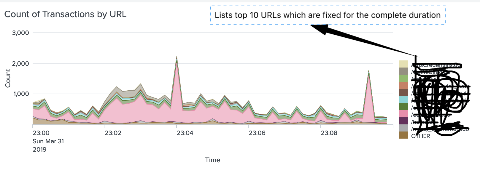
Which results into below visualisation. Please note that whatever time range we select, at any bucket [data point] graph always shows the top 10 same URLs and will not change for each data point. So throughout the timeframe we see only top 10 URLs.
I created similar visualisation in Kibana as shown below.

which resulted into below graph:

Is it possible to get overall top 10 URLs listed throughout the graph instead of per bucket top URLs in elastic. Please suggest how to get similar behaviour in Elastic and Kibana.
Thanks,
Ravi
