I am having an issue with a timelion visualization that calculates the percentage loss. It does this by summing one value from one index and subtracting another value from a different index, the dividing by the original sum value and multiplying by 100 (if there's an easier way to do this, i'm open to suggestions).
While this appear to work on the face, we have noticed that the range of the chart is very different based on how tight your timerange is. When viewing a longer timerange, the percentage seems to be significantly lower than when zooming in.

in the above image, the timerange is about a month. You can see the percent loss is within 3-4.5%
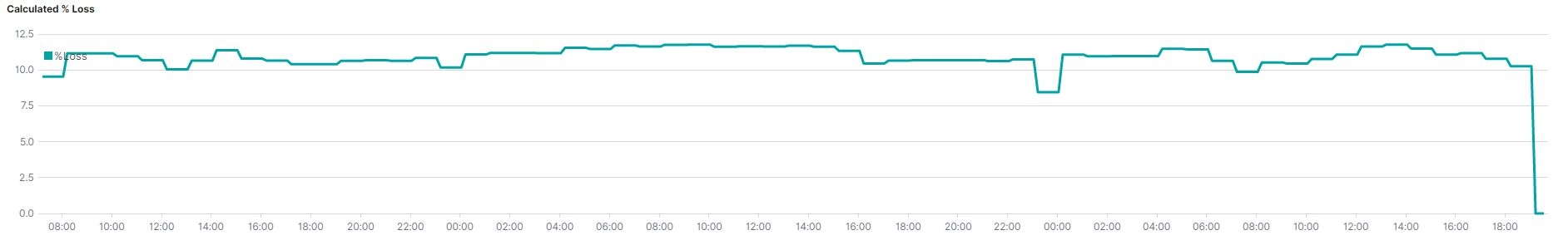
But when zooming into a subset of days, we can see the actual loss hovers around 10%
Below is the expression being used:
(.es(kibana=true,index=client-sub*,metric=sum:HrVal).subtract(.es(index=client-cust*,metric=sum:usage, offset=-1h)).label(%Loss)).divide(.es(index=client-sub*,metric=sum:HrVal)).multiply(100).fit(scale).scale_interval(1h).trim()
Any thoughts on why this is happening or adjustments on this expression to get it to work more consistently?