I want to visualize electric load profile weekly wise. The electric load profile has the electric load readings taken for every hour on each day.
Typical CSV columns are date,day,hour,load.
In a day 24 readings are taken, in a week (7 multiplied by 24)=168 and in a month (168 multiplied by 4)=672 are taken. So there are around 700 rows for a typical month.
I want to have visualizations for weekly wise, day wise, hour range wise etc., As of now I am just using only two columns with serial number and load. And two visualizations I made.
One as x axis serial number from 1 to 700. And y axis as load.
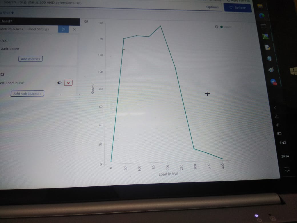
Second as x axis load and y axis as count.
How to have different combinations of visualizations for day wise and hour wise.
I am using python client to create elasticsearch object and using CSV reader to read the file and populate elasticsearch object.
Date,day,hour,load in kW
1st April 2019,Monday,1 AM,50
1st April 2019, monday,2 AM,72
.
.
1st April 2019,Monday,9 AM,200
.
.
1st April 2019,Monday,11pm,55
Since I don't know how to show date and day in visualization I made CSV with two columns serial number,load because they are numbers. I know only to create visualization with numbers.
I created one histogram with x axis as serial nbr and y axis as load.
Second visualization I made with count as y axis and x axis as load. So I can see one particular load how many times occurred in a month.
Ok Warkolm. Then I have to find how to write python client code for creating timestamp and populate that into elasticsearch object. So you mean to say I will have only two columns ? Timestamp, load.
Is my understanding correct ? What is the visualization then for this kind of data structure ?
Yeah. Multiple sources of data as of now not there. But good that you have given valuable insight what if there are multiple sources of data. I will have to explain this.
Could you point me to some visualization involving timestamp. I am having little difficulty in understanding how a timestamp actually appears in a typical visualization. Because I always assume visualization means only numbers on x axis and y axis. Eager to know how timestamp appears in a visualization. Thanks
Apache, Apache Lucene, Apache Hadoop, Hadoop, HDFS and the yellow elephant
logo are trademarks of the
Apache Software Foundation
in the United States and/or other countries.