I was given this task of creating a dashboard of the rpm and duration of the transaction. I am using the apm server and agent to get the default dashboard. I am also required to create the dashboard comparing current, yesterday and last weeks rpm and latency for which i am using timelion to generate the graphs.
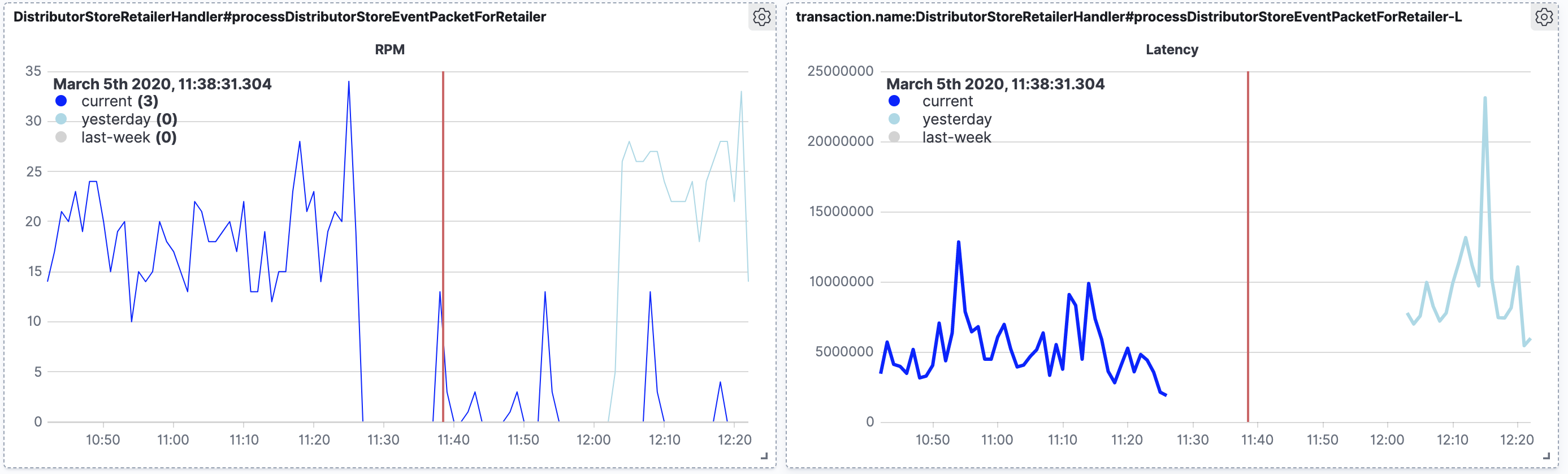
This is the picture for what i have done till now. The problem is that there are datapoints in the rpm when i compare with the latency graph which does not give me any plots in the graph.
the query that i use for the latency graph is this: ".es(q=transaction.name:DistributorStoreRetailerHandler#processDistributorStoreEventPacketForRetailer, metric=avg:transaction.duration.us).label(current).color(blue),
.es(q=transaction.name:DistributorStoreRetailerHandler#processDistributorStoreEventPacketForRetailer,metric=avg:transaction.duration.us, offset=-24h).label(yesterday).color(lightblue),
.es(q=transaction.name:DistributorStoreRetailerHandler#processDistributorStoreEventPacketForRetailer, metric=avg:transaction.duration.us, offset=-1w).label(last-week).color(lightgray).title(Latency)"
I wanted to know if there was a way i can solve this.