So I have warehouses that use RF guns and the error messages are garbage. The complaint becomes its a network thing so I configured heartbeat to pingsweep these warehouses on the subnet that has the RF guns.
Problem is not all IPs pinged are actually in use and the guns are not statically assigned so I end up with many IPs showing all down.
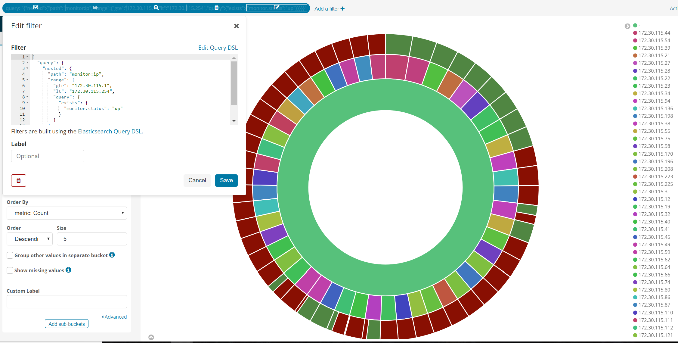
Essentially I need a filter query to only show instances where the ip in that range have at-least 1 "up" result in the time frame requested so that the doughnut chat can work.
this image says it all I am a noob and lost, i know how to do this in splunk but not ES/Kb
@Rich_Greco if you add another filter that only includes documents with monitor.status of "up" you should get what you're looking for:
So I dont just want to see what is up, I want to see the ratio of up/down for IPs where there has been atleast one up session recorded as a way of filtering out unused IPs.
If I toss in a filter it only shows up status, is there a way to filter out exclusive down status but leave in up and up/down?
@Rich_Greco I can't think of a way to do this with the built-in Visualizations without using the bucket script aggregation which isn't available yet in Kibana's visualizations.
I'd encourage you to give this [issue]((https://github.com/elastic/kibana/issues/4707) a +1 or chime in with your specific use-case so we can prioritize it appropriately.