Sorry if this has been asked before but I am monitoring some of our network switches via snmp call every 30 seconds and logstash
The information I am getting back from the switches is the cumlative bytes on the network port, what I would like to do is graph the difference between the records
for example
00:00:30 cumlative bytes in for port 1 is 1000
00:01:00 cumlative bytes in for port 1 is 2000
00:01:30 cumlative bytes in for port 1 is 2200
Is it possible to show a graph that would show 1000 and 200 as the data points as this is the difference between the previous record.
I hope I have explained this OK
Thanks
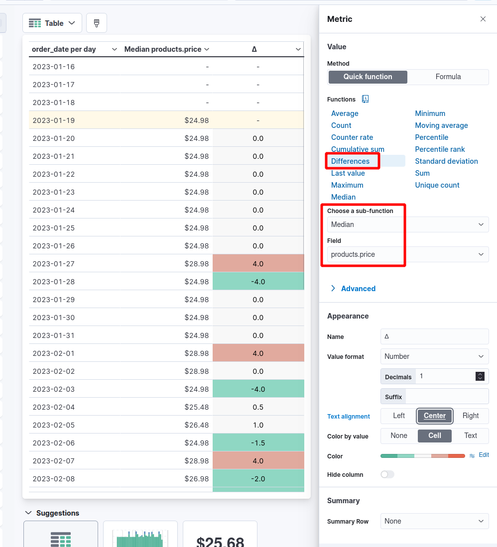
In Lens you can use the Differences function to do that. Mind that Lens (and almost everywhere in Kibana) is all about aggregation, not individual documents.

So for the Kibana Sample Data eCommerce data view you can for example render a table with the median of product.prize and then the difference with the previous value.
In the case of the table viz you can even render your cells per value to higlight positive or negative values and so on.
k