I have some data that's being exported from Prometheus as a histogram object. The data itself is how long a particular job takes to process, so the buckets are in 30 second intervals. I'm getting data from my containers that looks like this (as expected the histogram has both _count & _values arrays).

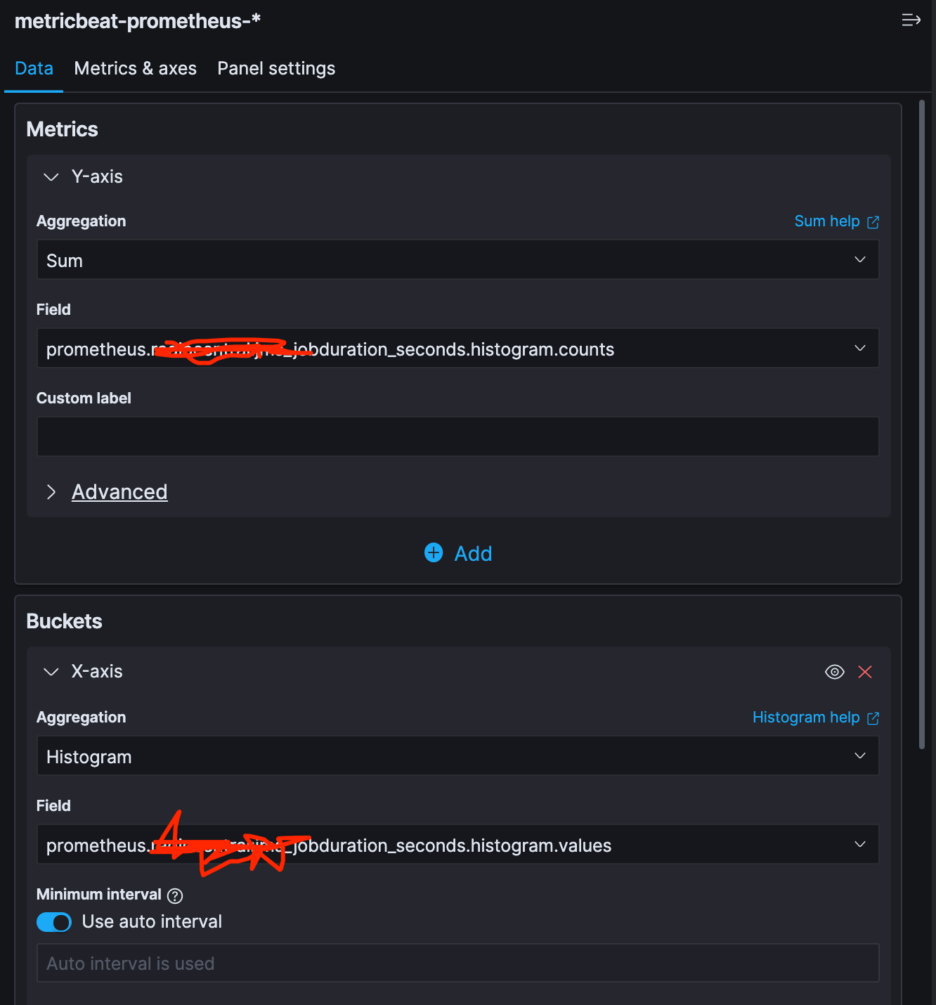
I'm trying to visualize this as a vertical bar chart (histogram) - here's how I have it set up:
- Y-Axis - Sum of _counts field
- X-Axis - Histogram aggregation, on the _values field.
Screenshot:
However, the results aren't what I'm expecting. Based on the sample data in the screenshot there are lots of buckets that have 0 values, and only a few buckets that have actual counts in them. So I'm not expecting to see this:

Any idea on what I'm doing wrong? I'm only minimally familiar with Kibana. Thanks!