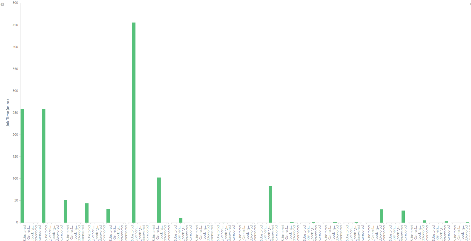
Is there an option to have a scroll bar so that the each entity on the x axis is clearly readable?
There is not. If what you care about are the larger values, and not the "long tail" of values to the right, you could limit the results to Jon Times above a certain threshold. That way, the presumably unimportant values to the right, the jobs that run quickly, don't even show up, and the slower jobs become much more readable.
Also, when I split the chart based on the hierarchical level of the jobs , I get the message This container is too small to render the visualization
This is something of a known bug with our visualization library. What it really means is that the chart that it would render in the space provided would pretty much be useless, as the data would need to overlap, or be unreadably small to fit in the constrained space. What is causing that condition isn't always clear.
The chart you're trying to create here doesn't seem particularly useful, as you're using the same value on the axis and splitting up the chart. What is it that you're trying to visualize? Maybe I can help provide some other ideas for seeing that data.
Here each - represents a different level in the hierarchy. I use the ruby filter in my logstash config file to obtain the time taken by each job. My aim is to have a visualization where I can represent the jobs in the form of a tree, just like the Navigation pane in Windows, and have the ability to drill down/roll up on the jobs in order to view the statistics of jobs on different levels.
To get the hierarchy, I modified my log file so that each job name has all its parents prefixed to itself. Now the fields in my index pattern as as follows:
p1_jobname, p2_jobname, p3_jobname, ...., job_time
where p1 represents all the highest level jobs, i.e, level 1 jobs, p2 represents the level 2 jobs and so on.
As I was not able to find a tree structure in Kibana visualize tab and also any Kibana visualization plugins for the same, I thought of using the vertical bar chart, representing the job names on x axis and their corresponding times on y axis. I was trying to have all the highest level jobs in one chart. Upon clicking on any of the jobs, I wanted to drill down and show its respective child jobs in the same/different chart. I was representing p1_jobname on the x axis and splitting the chart on the field p2_jobname and then splitting the bars on the field p3_jobname. I noticed that I can only go down to a max of 3 levels of the jobs by splitting the bars and the charts.
Apache, Apache Lucene, Apache Hadoop, Hadoop, HDFS and the yellow elephant
logo are trademarks of the
Apache Software Foundation
in the United States and/or other countries.