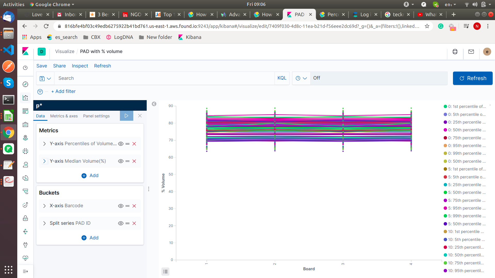
The above chat two x-axis bucket one is the barcode and another component-id. In y-axis volume and median of the volume.

I am able to draw first leave volume but not able to draw the median of the volume of the barcode.
The above chat two x-axis bucket one is the barcode and another component-id. In y-axis volume and median of the volume.
I see - when you are splitting by series you have the same problem as with the overall average - there is no way to “go up” in the aggregation tree and create a metric for the overall average without considering the split.
Do you really need this split? As the values for the percentiles are overlapping anyway you can’t see the difference between the multiple pad ids - it’s just one big blob. Wouldn’t it make more sense to show a wider range of percentiles for all pad ids?
Another solution that would also show the differences in the different pad ids ist to use a split charts as rows instead of a split series for pad Id. This will get you one chart per pad id with its own average line
I have multiple barcodes and every barcode contain multiple pad ids and every pad id has volume %.
I want show the barcodes with pad id volume % and all pad ids of bar code volume % median in chart.
© 2020. All Rights Reserved - Elasticsearch
Apache, Apache Lucene, Apache Hadoop, Hadoop, HDFS and the yellow elephant logo are trademarks of the Apache Software Foundation in the United States and/or other countries.