Hi
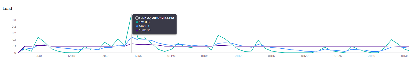
Can you please explain what this graph is showing exactly. The legends are not clear to me to what actually they mean.
I am referring to the hover over values shown. What does these colors indicate.
Hello,
That appears to be a system load chart from the Host Overview dashboard. The labels refer to the system load average from the last 1, 5, and 15 minutes.
The colors help identify each time window. They don’t relate to if a value is high/low/etc.
I hope that’s helpful. Please let us know if you still have questions.
Thank you.
© 2020. All Rights Reserved - Elasticsearch
Apache, Apache Lucene, Apache Hadoop, Hadoop, HDFS and the yellow elephant logo are trademarks of the Apache Software Foundation in the United States and/or other countries.