When you create the line chart, you will need to pick a metric aggregation type (avg, min, max, sum, etc) and a field to use in calculating the metric. The chart will have dots where the metric values are, with lines connecting the dots.
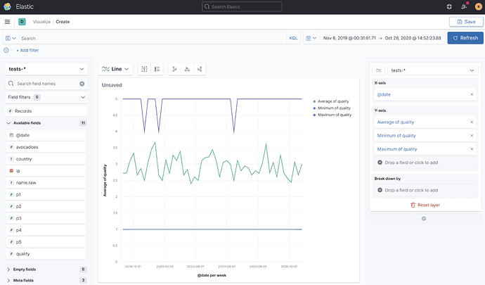
It might be useful to you to see the min, avg, and max metrics of bandwidth.all over time. You can create that line chart in Lens.
Looking at this in Kibana 7.10:
- From the side navigation bar, click Visualize and then "Create visualization". Under " Select a visualization type", click "Go to Lens".
- In Lens, choose the data source from the index pattern dropdown, and pick a time range that displays enough data to work with. Lens will then show a list of fields in the left sidebar.
- In the Chart Type picker, choose "Line" as the type of chart. The default is bar chart.
- Drag the
bandwidth.allfield into the preview area. By default, theaveragemetric is selected. Lens will show you a line for average of bandwidth.all in the chart. - For the
minandmaxmetrics, click "Drop a field or click to add" on the right-hand sidebar under Y-Axis. Selectbandwidth.alland change the metric type tominandmaxas needed.
You can customize the time interval by clicking the date field under "X-Axis" in the right-hand sidebar.
You will end up with something like this:
